The AirTrain at JFK Airport connects tens of millions of travelers each year to the New York City transit system. Their digital signage for train arrivals and system alerts was dated, cluttered, and difficult to read.
I worked with with the Port Authority of New York and New Jersey and Bombardier, the AirTrain’s operator, to implement updated digital wayfinding that fit within the constraints of their system while addressing issues found in user testing.
Defining the Problem
User outreach showed us, not surprisingly, that most travelers arrived at the airport knowing their route. While mapping and other details were helpful supportive elements, many riders just needed a large sign pointing them to the next train to Jamaica or Howard Beach, where they could continue their journeys.
However, this would have required re-configuring all signage and station elements to achieve this without losing secondary information, and the project was highly restricted in a few ways:
- No new hardware or signage would be installed, and nothing could be removed - all updates had to use the same TV screens that already hang in the stations, and we couldn’t remove some of the other promotional signage that created visual clutter.
- The software running the screens could not be changed significantly, meaning that the existing information needed to remain in roughly the same configuration on-screen.
- As a result of these restrictions, we couldn’t rethink the naming or wayfinding too significantly, as it had to remain consistent with other signage.
With these guardrails in mind, the solution needed to be as high-contrast, direct, and simple as possible, making the screens stand out visually as the authoritative wayfinding element.
Reducing Information to the Minimum
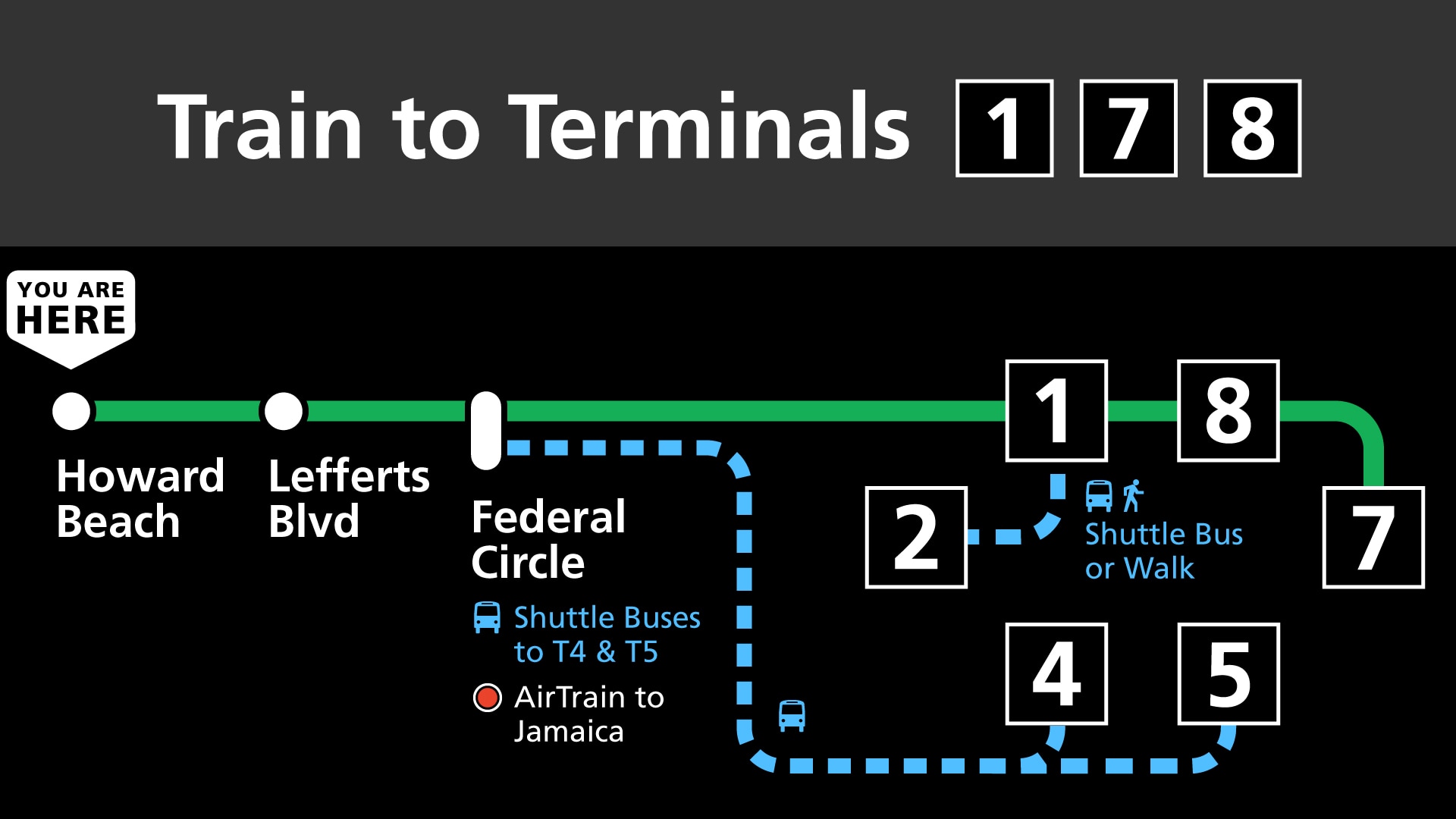
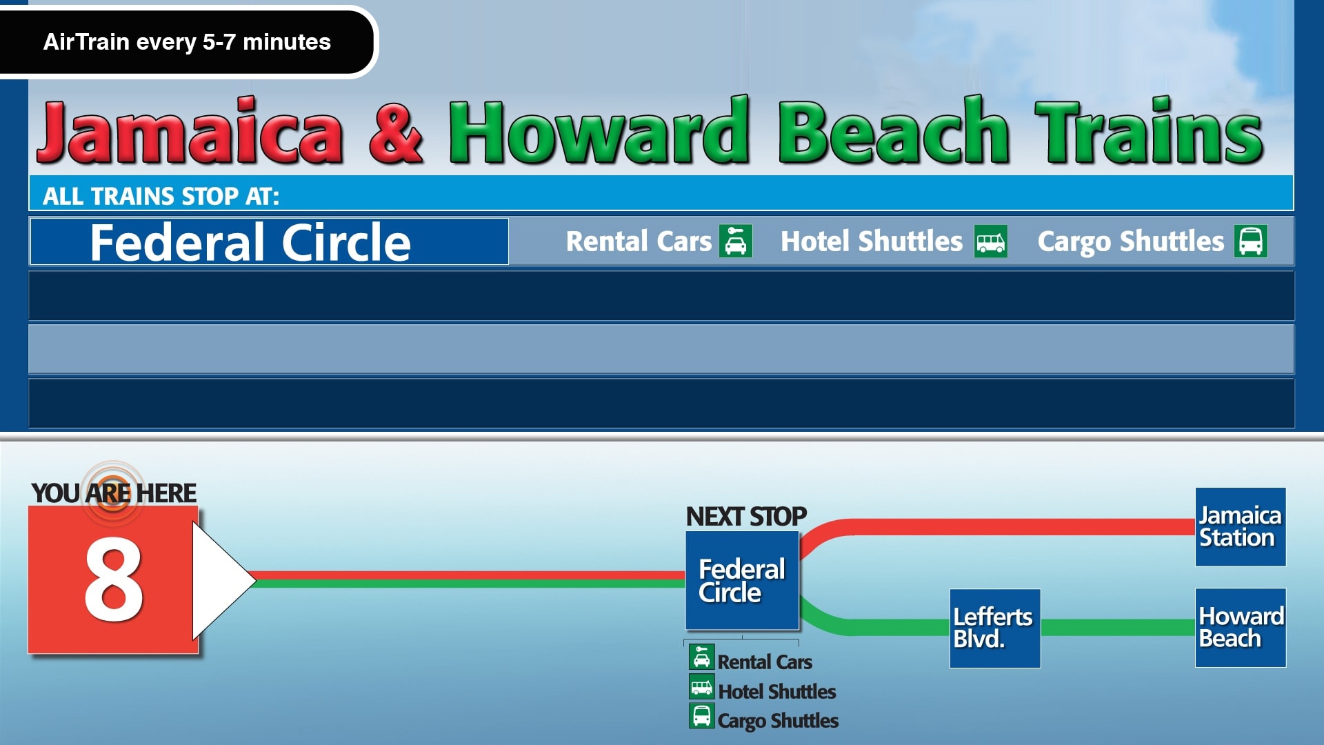
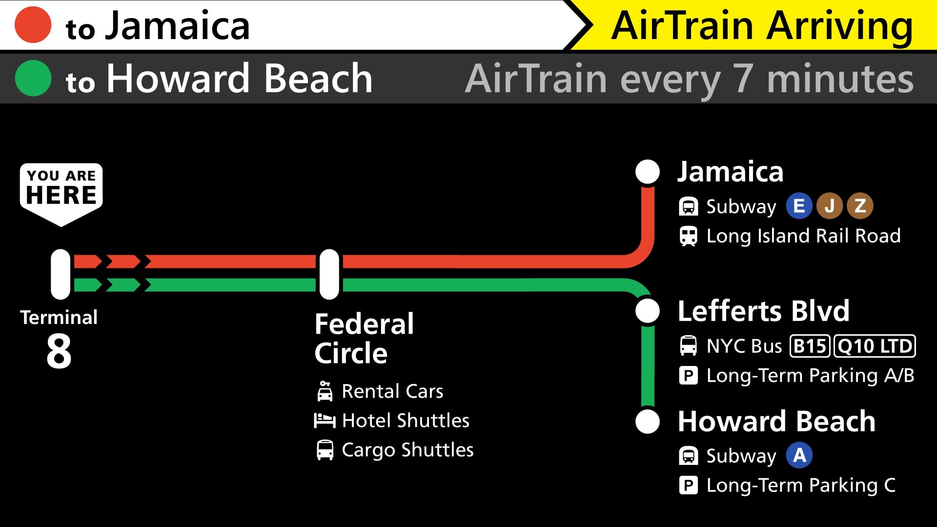
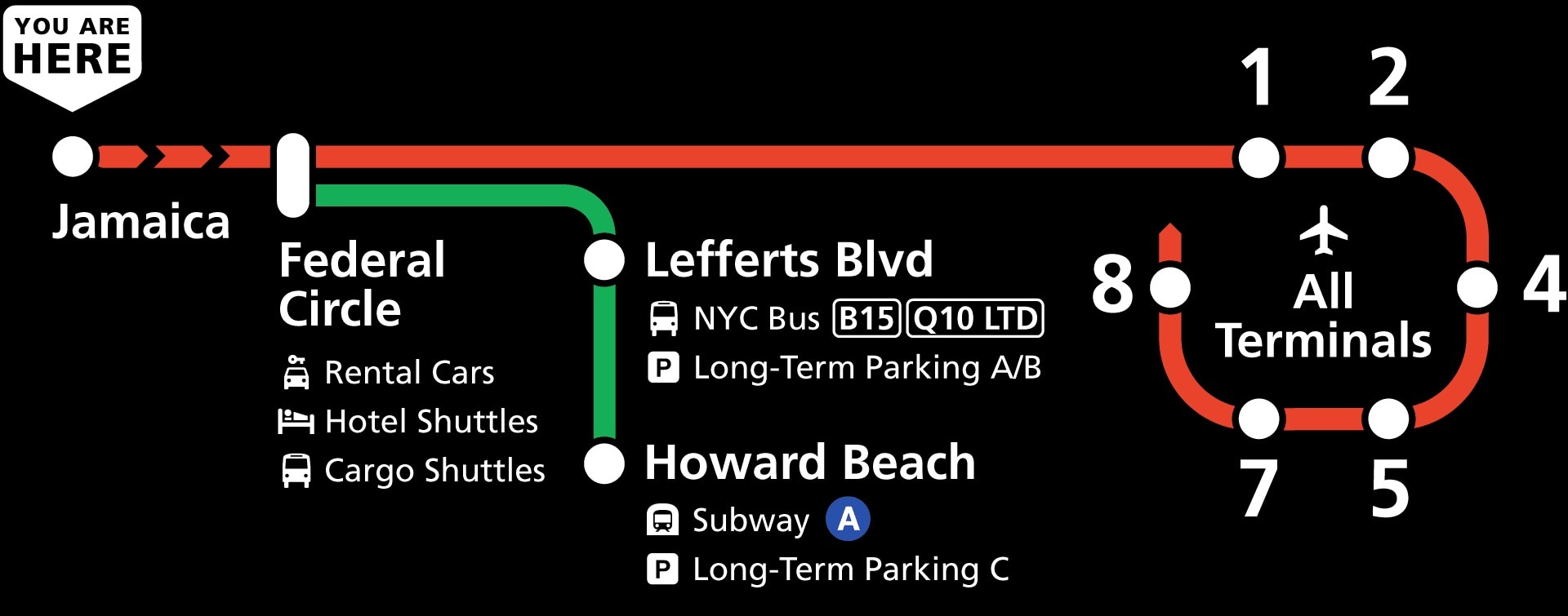
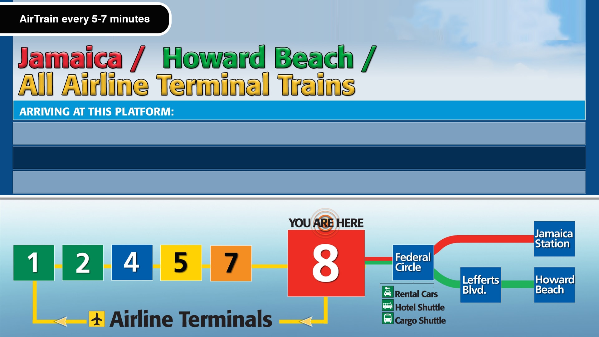
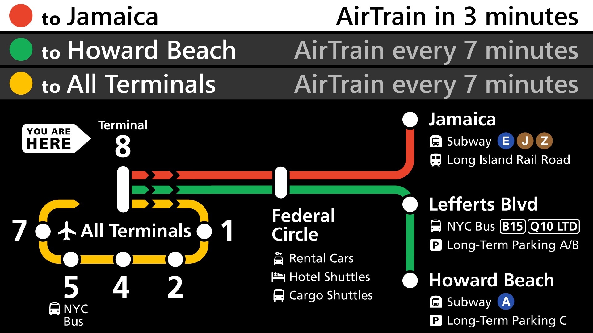
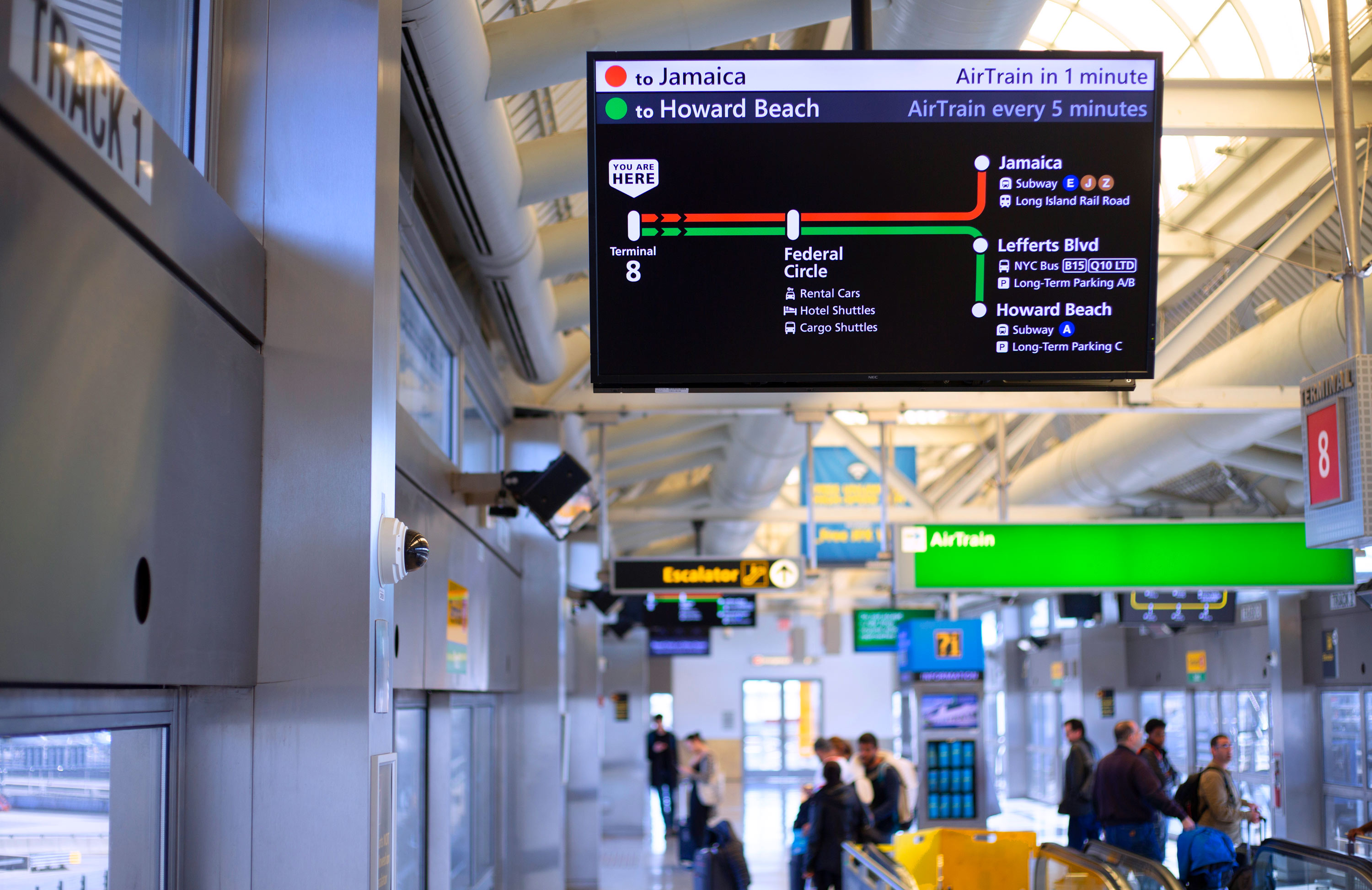
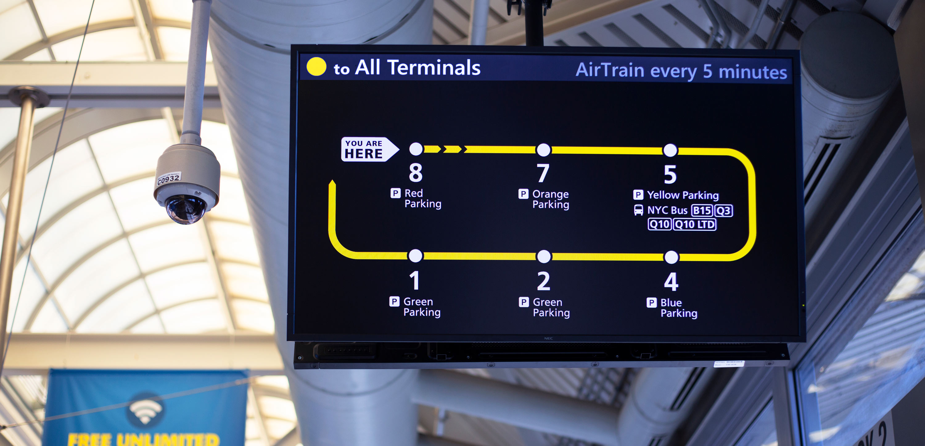
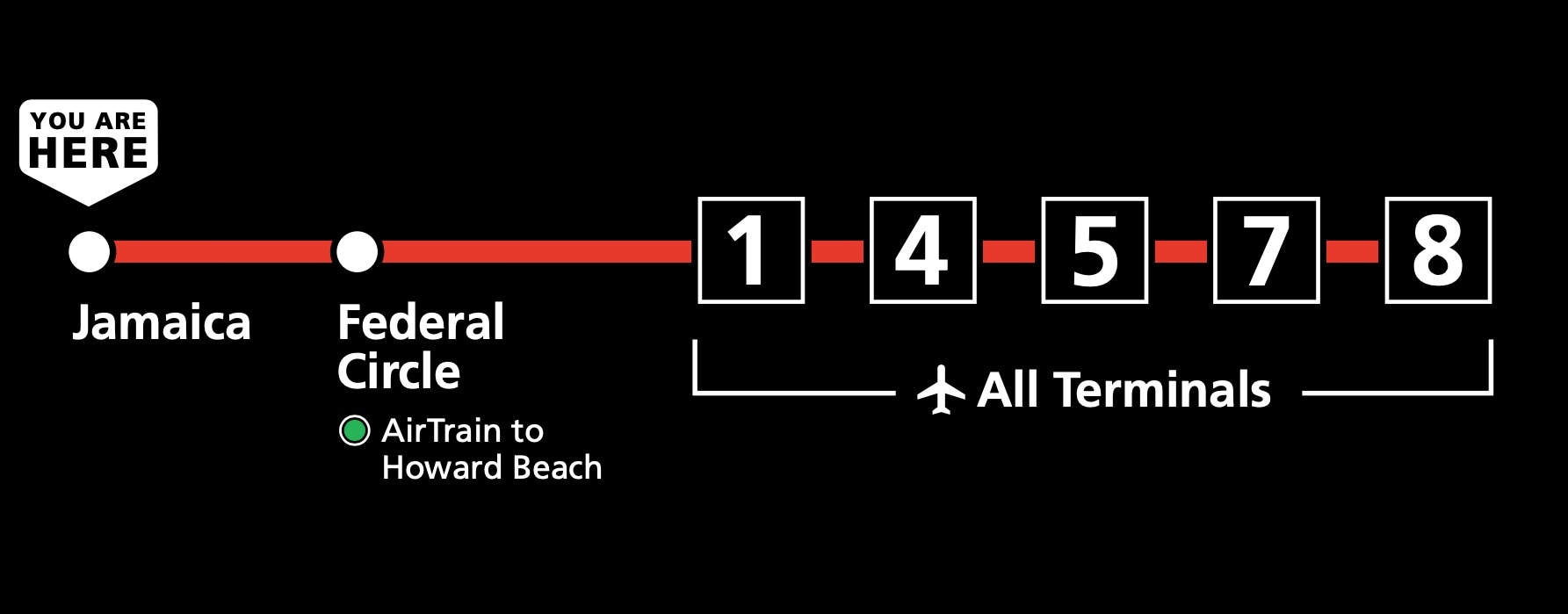
The first issue I tackled was the contrast and clarity of information on the on-screen route diagrams. Unlike a more conventional train or subway system, the vast majority of ridership will be first-time or extremely infrequent riders. Few will routinely visit different terminals. Because of this, I prioritized the clarity of the diagram at each station over consistency between them all.
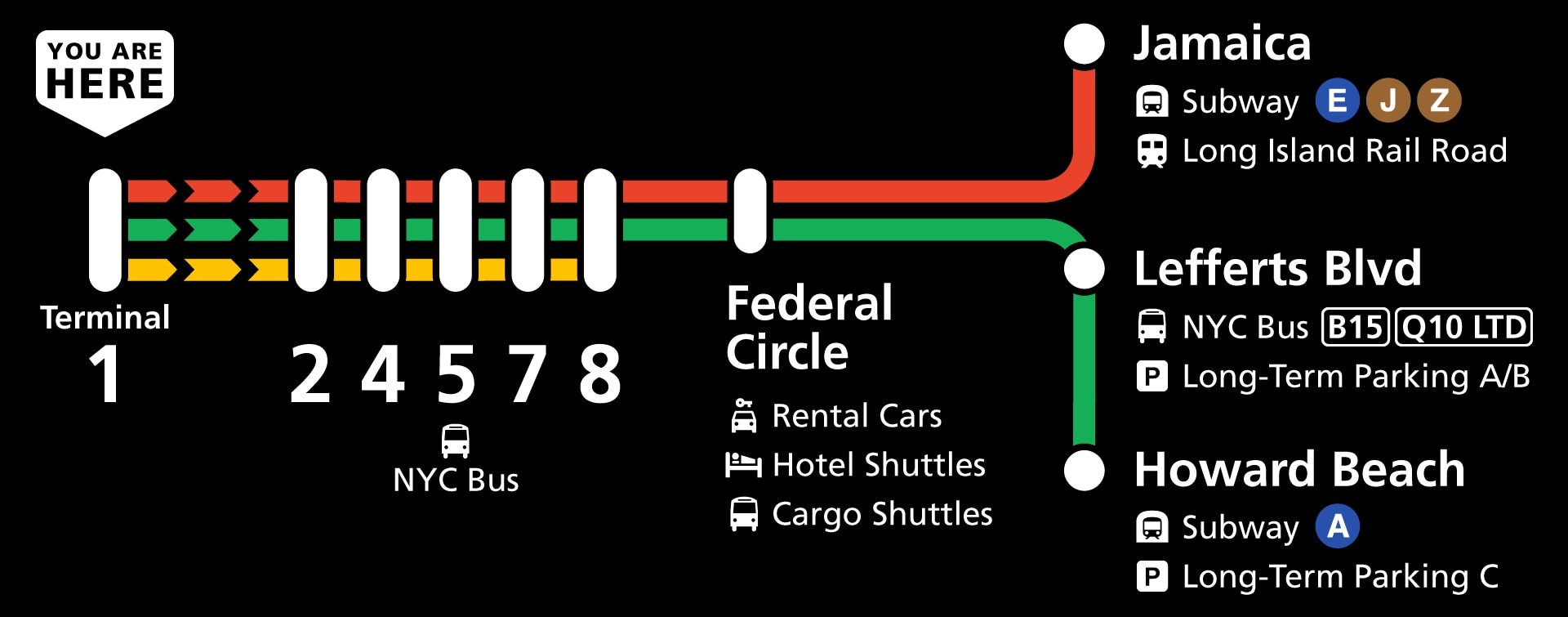
The diagrams don’t need to tell the full story of what the AirTrain system looks like, but instead provide clear, concise information on which stops you can access from a given platform. Instead of showing the full system on the on-screen maps, I show just the most direct route to access every other station.
I wrote a more in-depth case study about the process of figuring out how to best represent the AirTrain system in a small on-screen space.
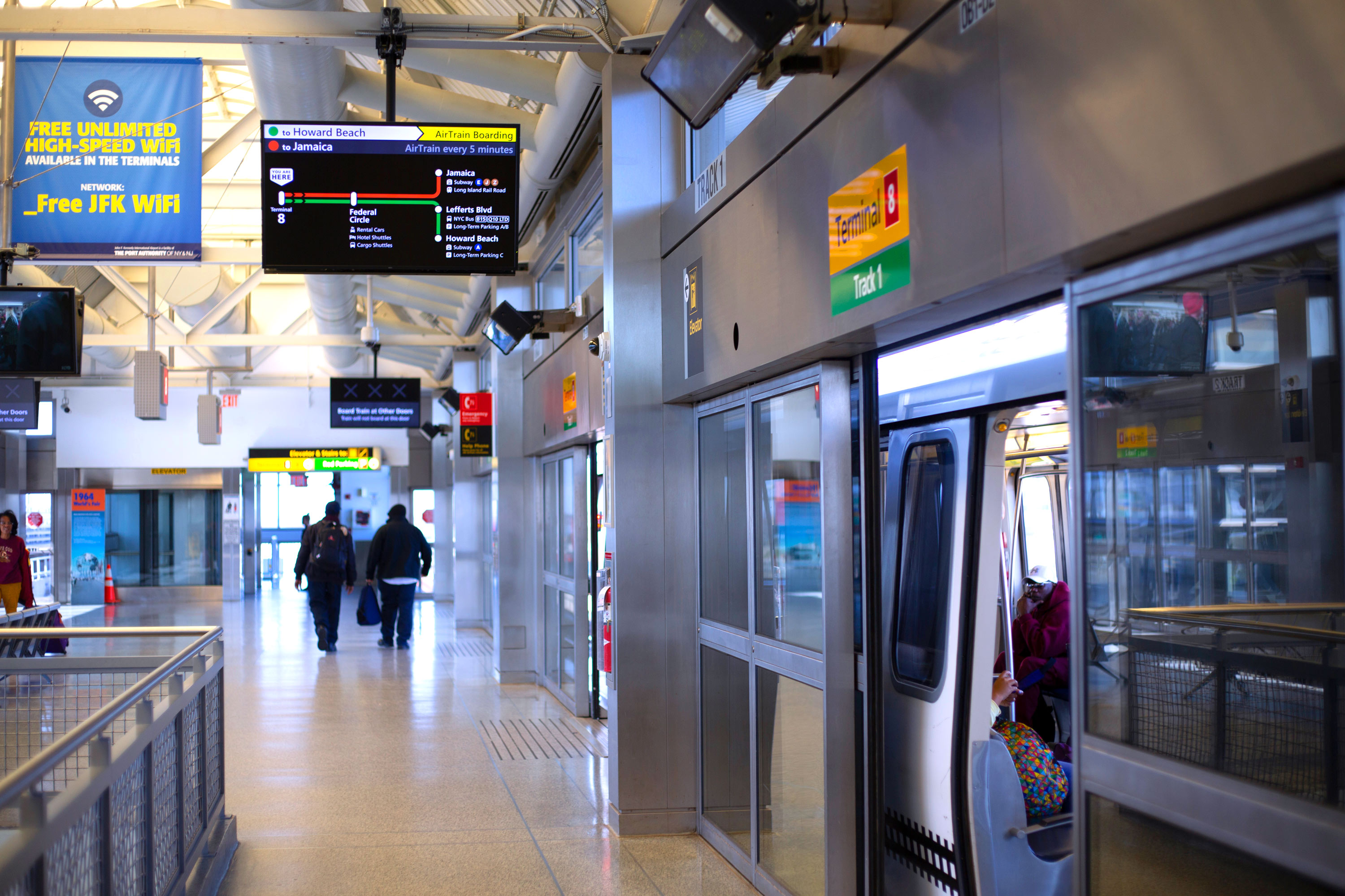
Highlighting Time-Sensitive Information
The diagram elements came together on the screen with improved and much larger arrival times for all the trains that will arrive on a specific track. This is the largest holistic improvement, ensuring that no matter when you arrive to the platform, you will be able to see where each train stops, even if it’s not the next train to arrive:
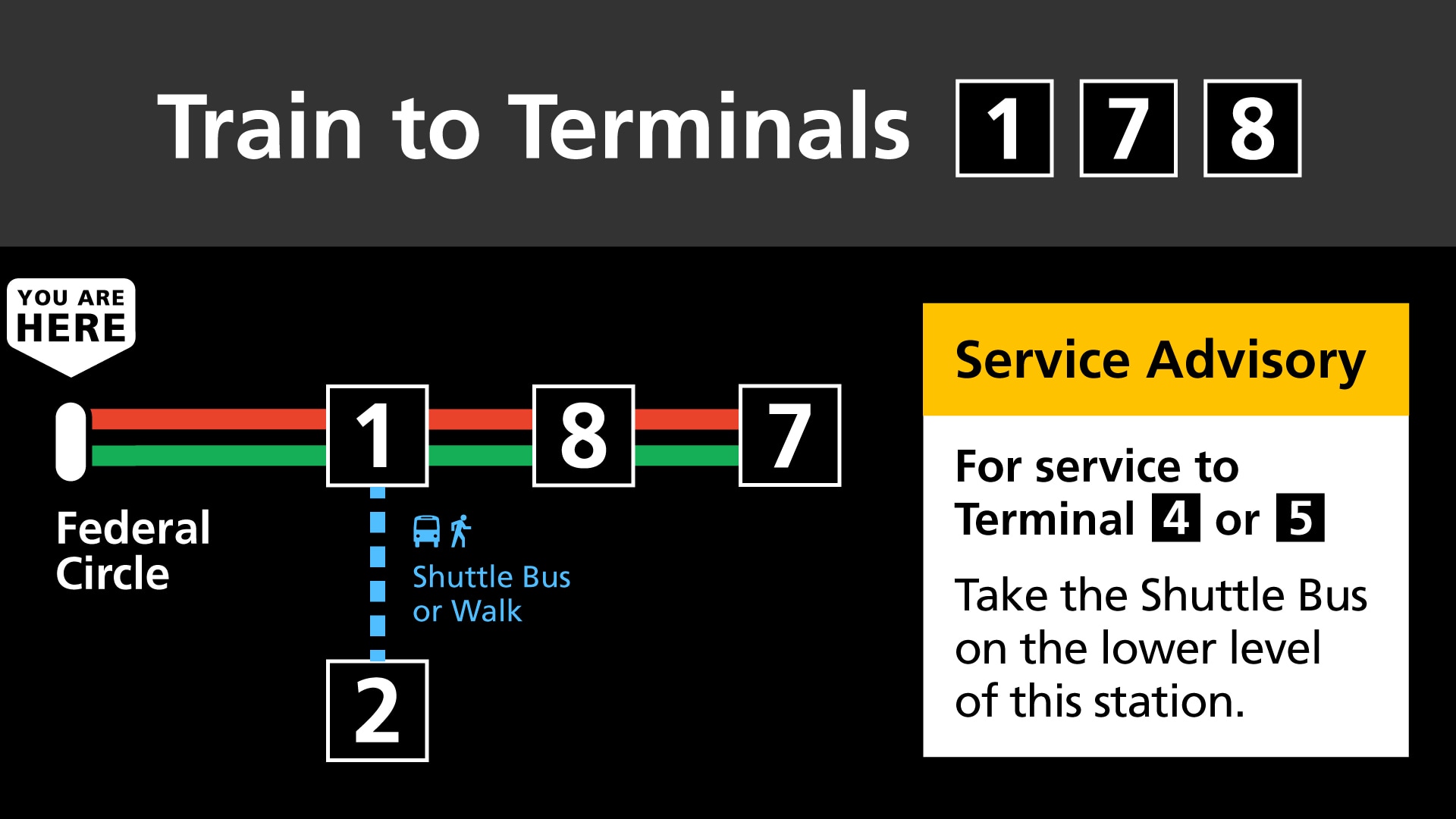
Improving Language for Service Changes
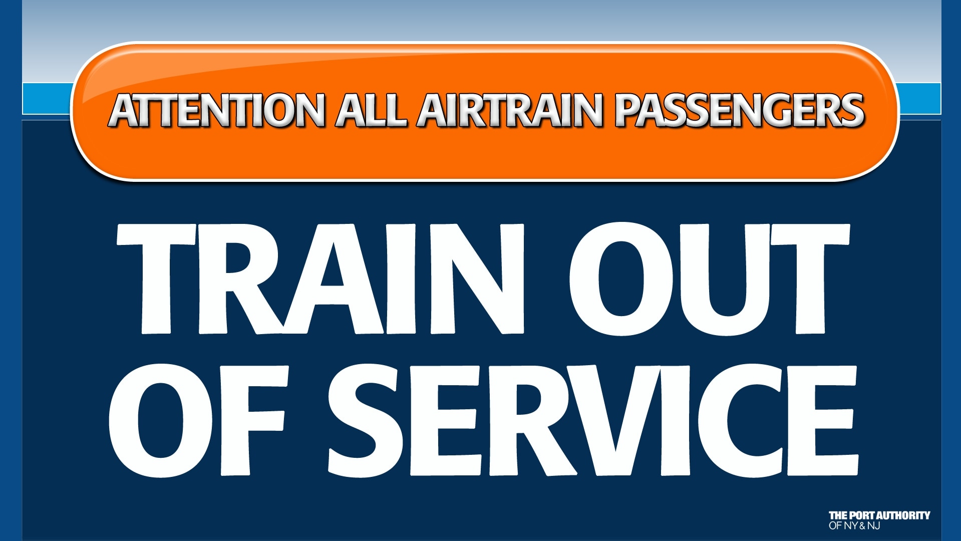
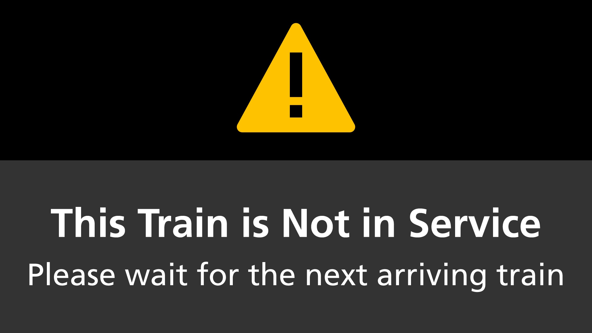
During construction or other unexpected closures and service changes, the existing designs varied wildly in both verbal and visual tone, often showing alarming-looking closure information instead of helpful directions.
I created new visual language and UX writing guidance to guide travelers to the right place instead of focusing on what was not working as expected.
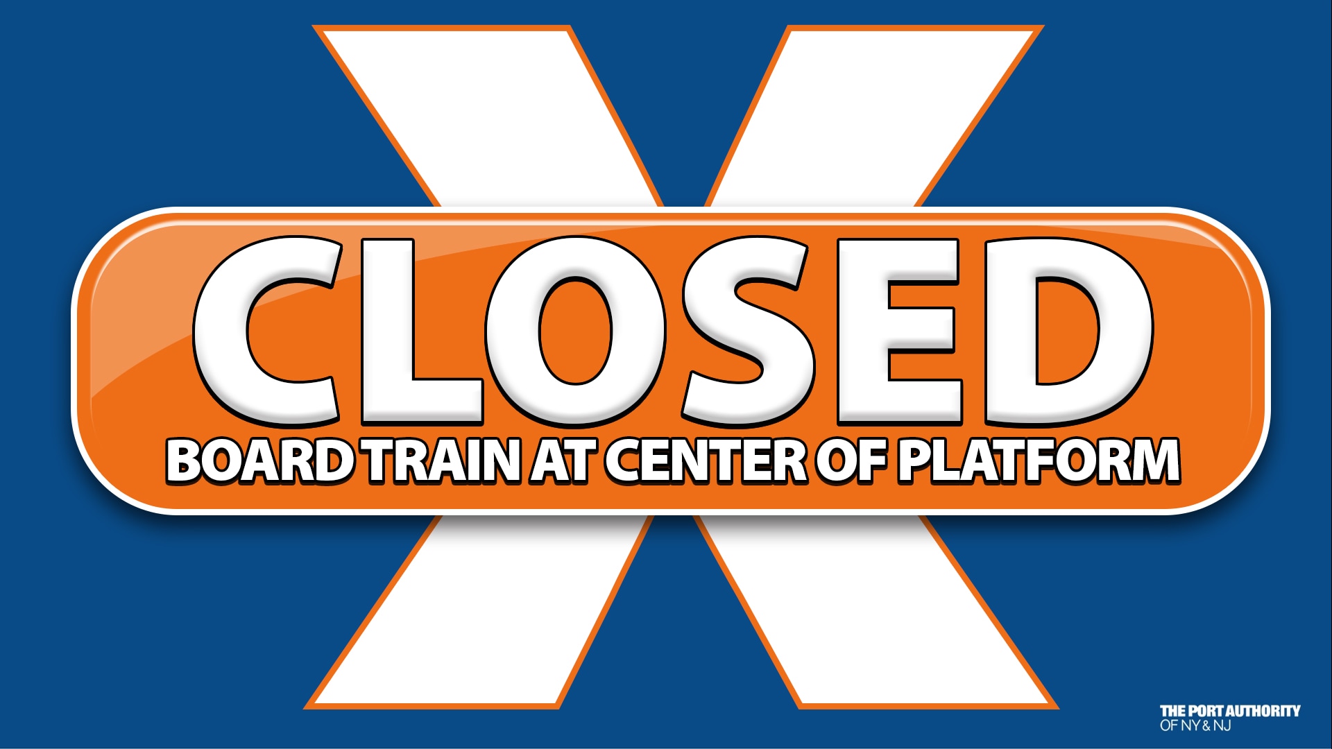
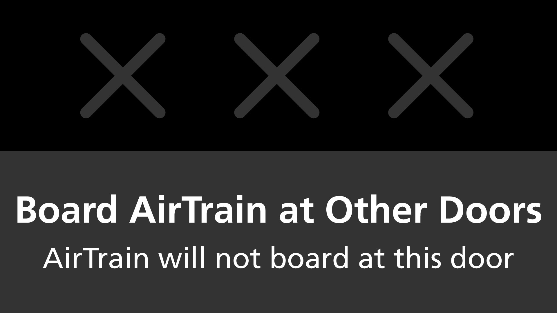
As one example, the existing signage for when a certain platform door was closed loudly implied that the whole station was closed. I created a much more subtle visual language that directs travelers how to continue the journey and lets the open platform screens stand out.
When the signs need to get travelers’ attention in the case of detours or other unexpected service, bright, simple icons attract the eye without distracting from the messaging.
Testing the Designs
Travelers were surveyed before and after the new digital signage was implemented in Terminal 8. Overall, first-time JFK travelers, frequent travelers, and airport staff all found the new signage improved their way-finding experience. Fewer people relied upon asking AirTrain staff for directions.
Based on feedback, we made some tweaks to the map design guidelines, including replacing the connections with other lines with a simple transfer icon and removing amenity information, as these elements cluttered the screens and were information that most riders already knew by the time they were standing on the platform.
These design standard changes were not immediately re-implemented on the screens, as the testing had been successful, but were used in all future updates to the signage.
Rollout and Updates
The new arrival screens were rolled out to all stations in the AirTrain system in Spring 2019.
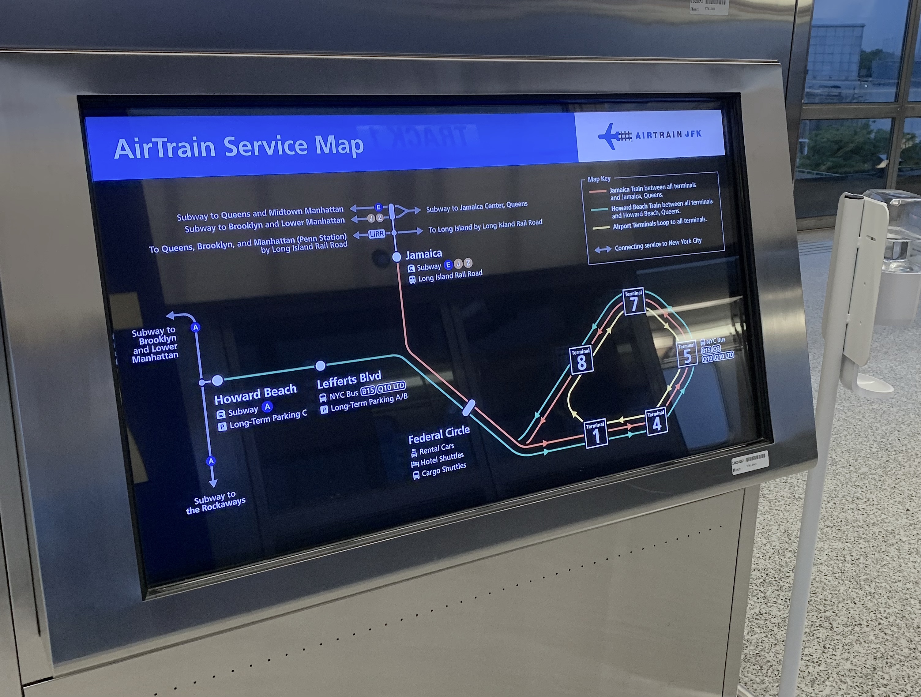
As the new signage was rolled out and became a prominent visual aspect of the stations, The Port Authority began to regard that look as their “brand” for the AirTrain in-station communication. Coinciding with a need to update their system maps for the long-term reconstruction of the airport, they requested that I create a new system map in the same visual language.
Following the rollout, I also developed updates to the visual language to accommodate construction notices and station closures related to the ongoing redevelopment of JFK Airport.