TopResume, one of the largest career-services brands in the world, provides online resume writing services at an accessible price point.
TopResume’s customers expect an easy experience that takes the stress out of the opaque process of properly writing a resume. However, our existing post-purchase experience was fragmented and lengthy, and wasn’t always getting our writers the information they needed to provide a great experience.
Making a Complicated Process Feel Easy
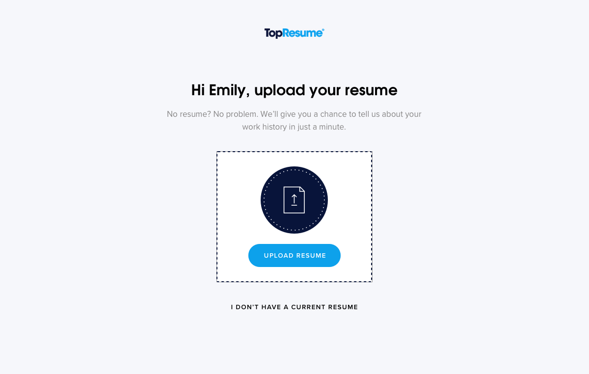
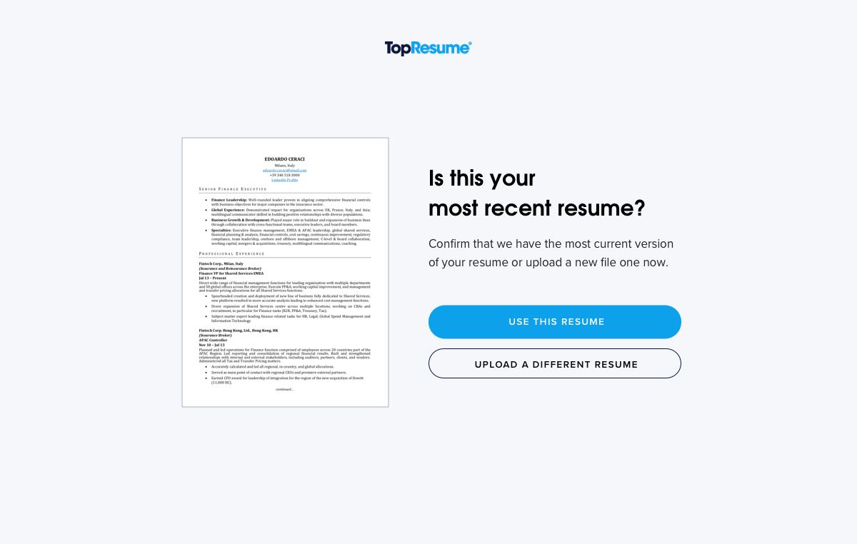
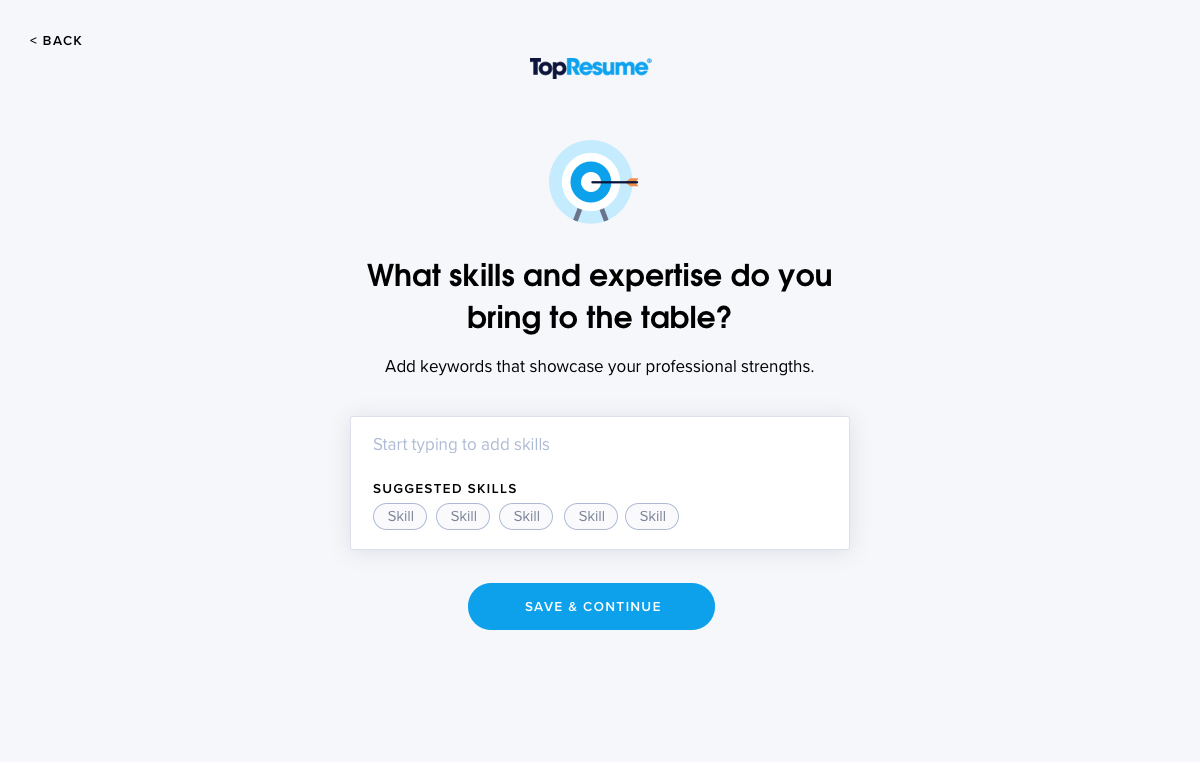
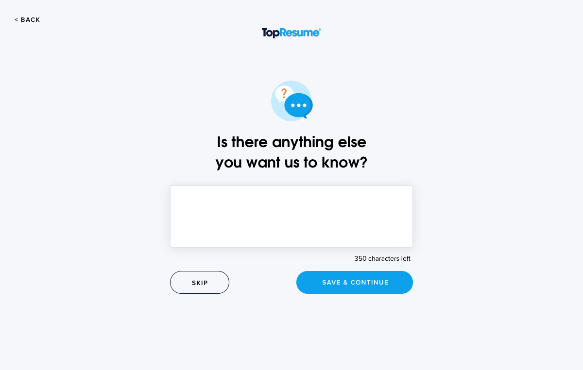
Our users for this project were not only our paying customers, but our freelance resume writers as well. A common frustration on both sides of the resume writing process was the experience of getting to know the customer's work history and job goals.
Customers felt frustrated that they had just paid us money only to be asked to spend time “doing work” by filling out this information. Resume writers felt frustrated that they weren't getting enough information to deliver a satisfactory resume, which could lead to customer service complaints.
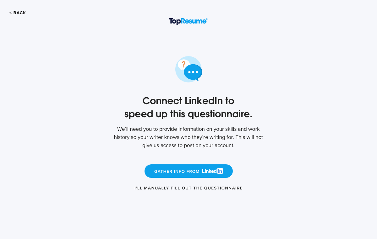
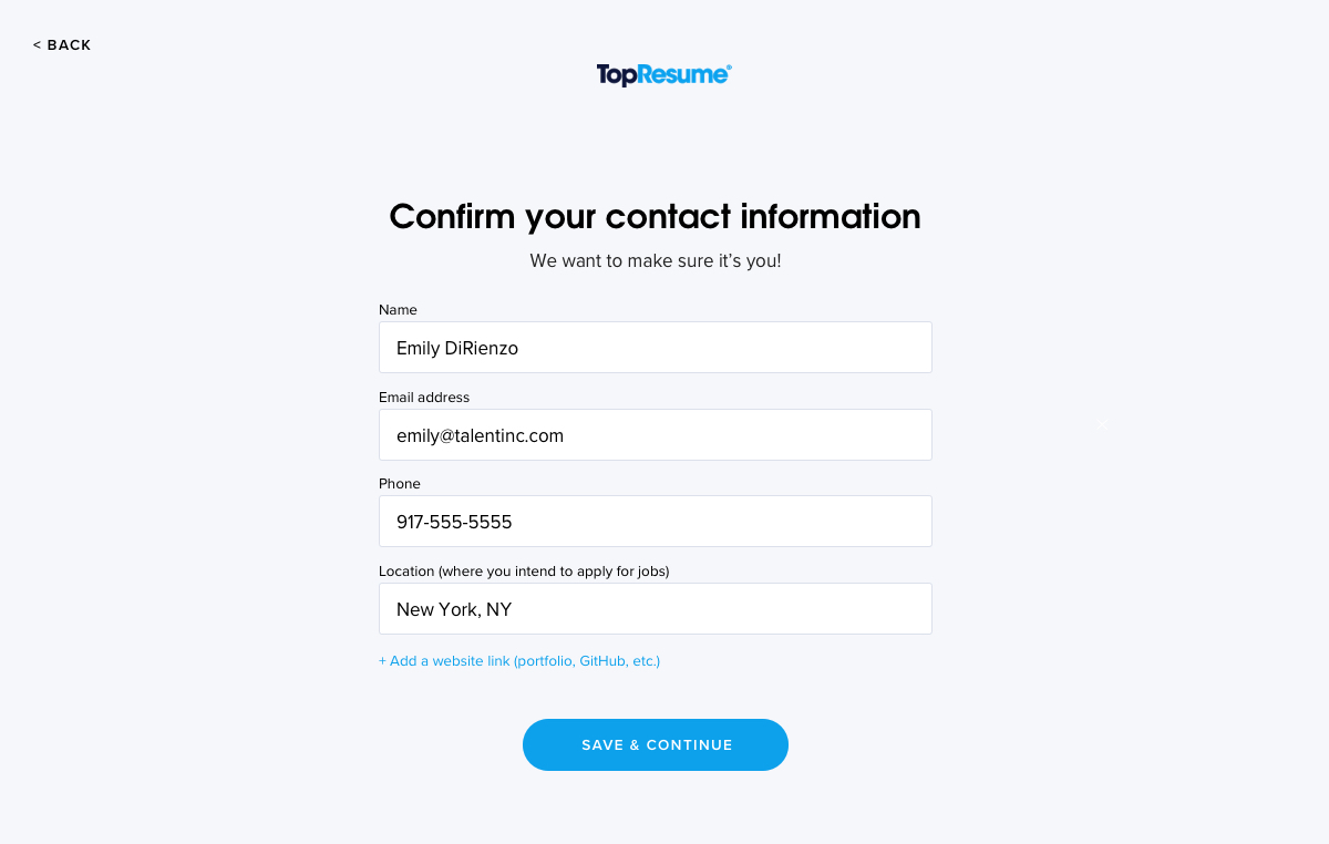
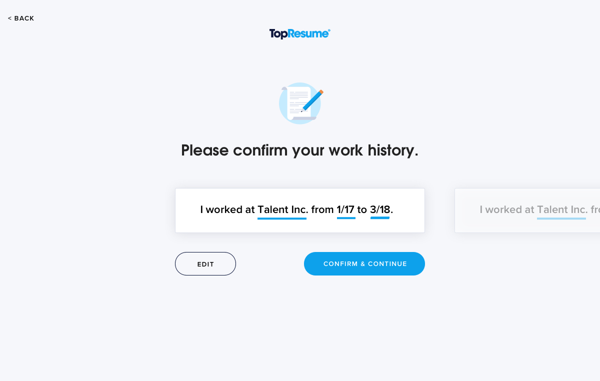
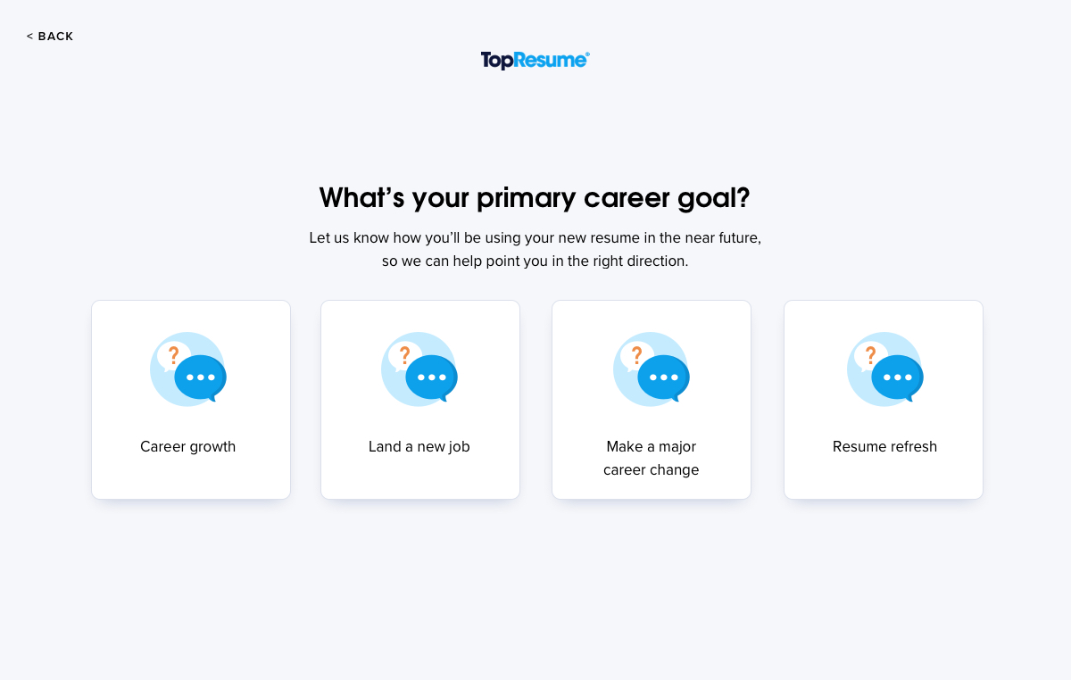
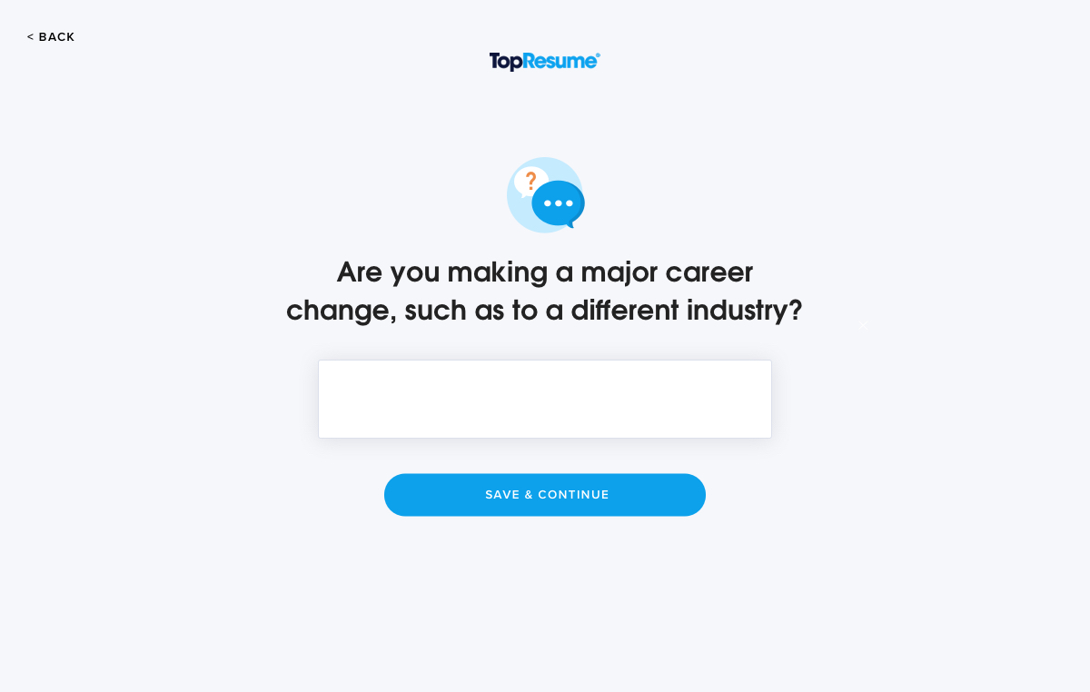
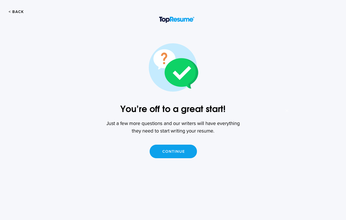
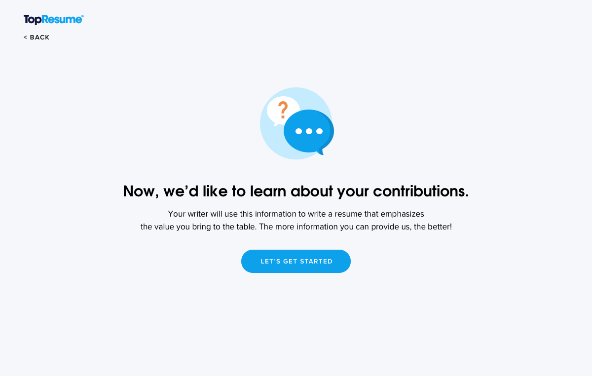
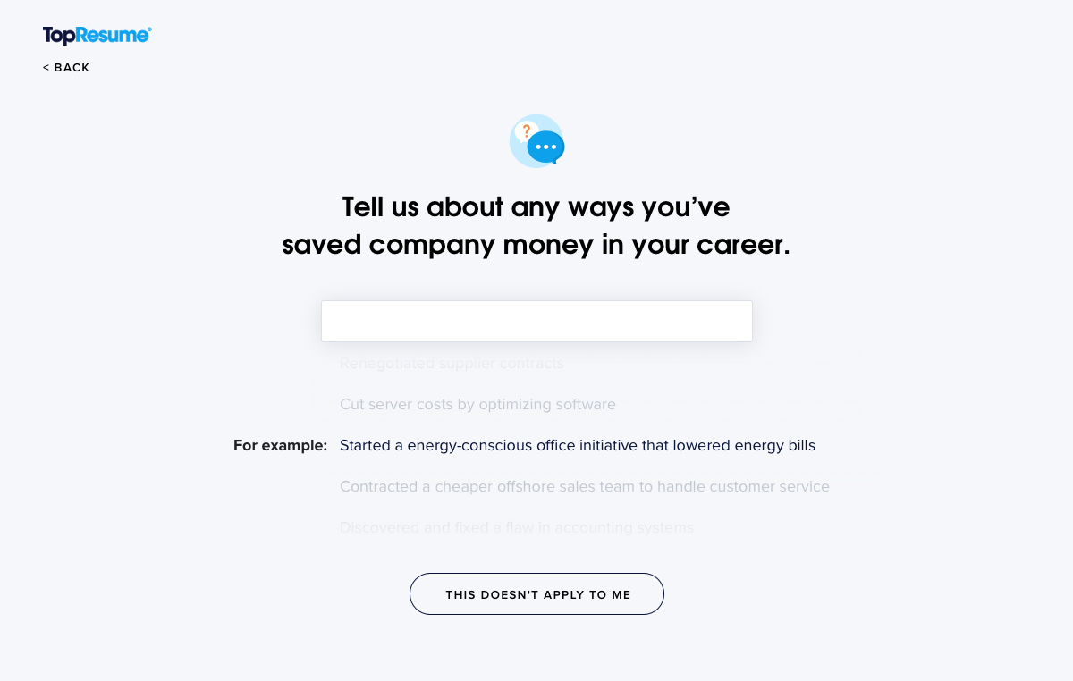
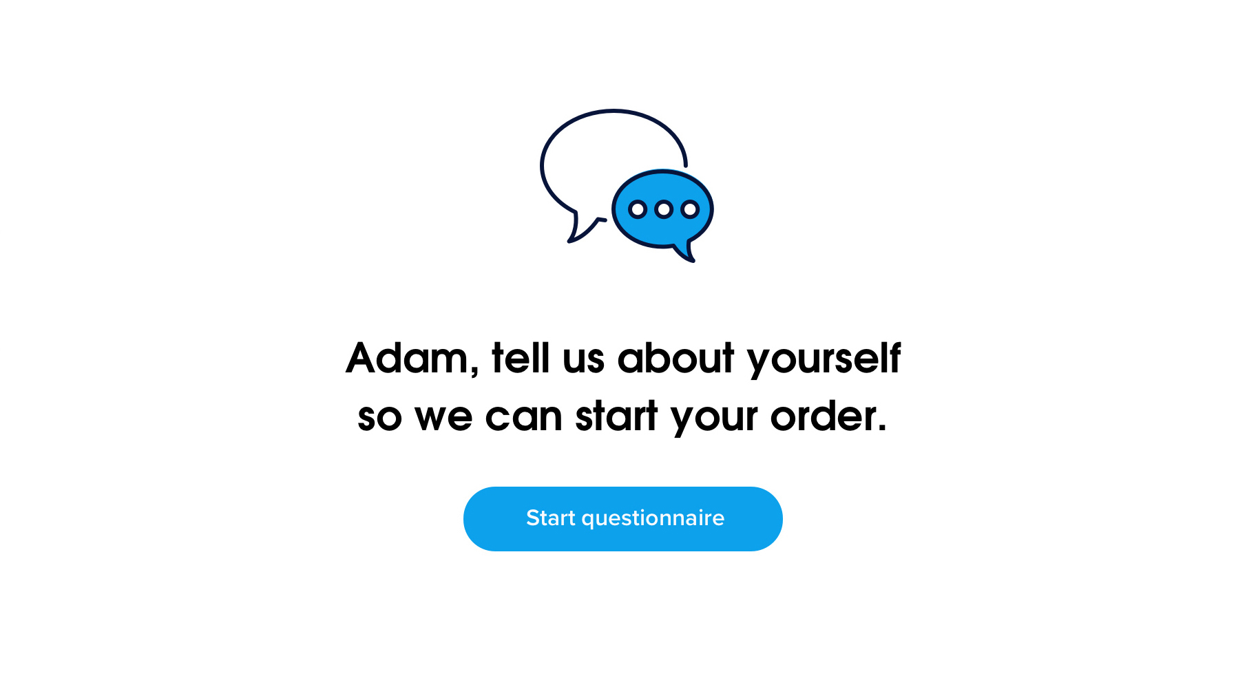
To eliminate this friction, we spent more time than ever focusing on the small interactions and design choices that would make the Dashboard feel quick and easy to use. We broke up what had been long fill-in forms about work history into quick multiple-choice and short-answer questions that the customer could leave and return to at any time:
Cleaning Up the Back-and-Forth of Revisions
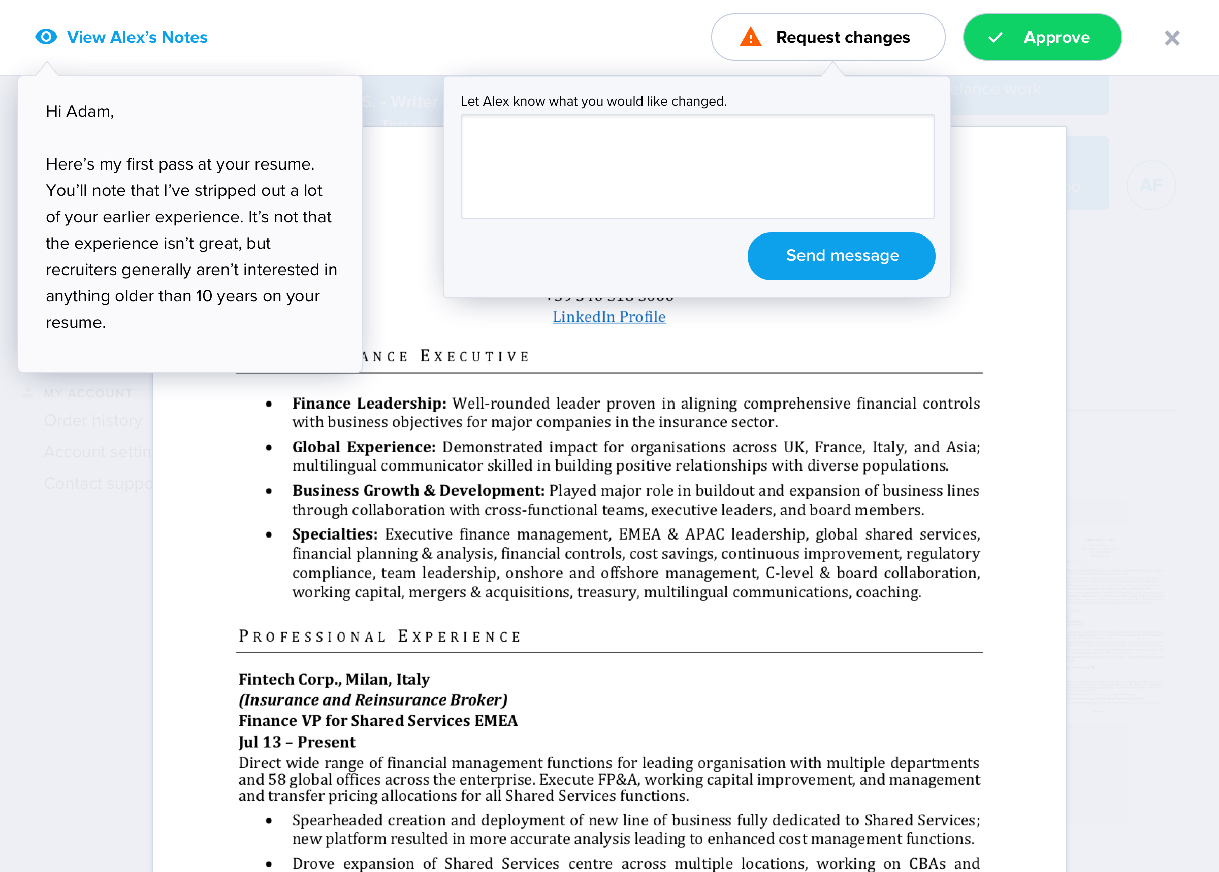
Another pain point for customers and writers was managing feedback throughout the revision process. In the existing system, customers would download the draft resume to give feedback, resulting in a loss of control of the process for the writer and the company.
Customers would give their feedback via email (sometimes over multiple emails), edit the document text itself, use the commenting feature in Microsoft Word, or even print out, hand-edit, and re-scan the resume.
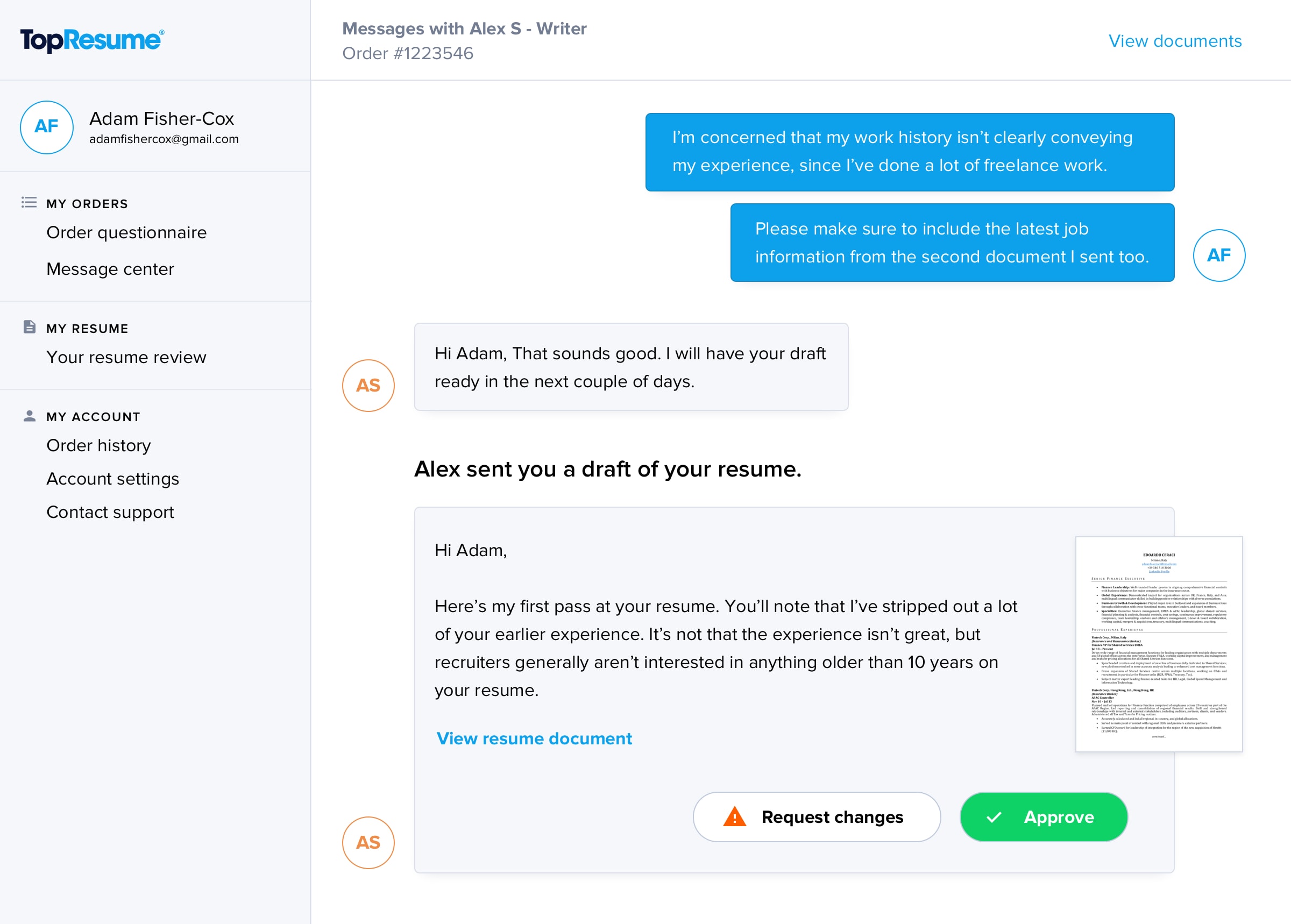
Putting this process on rails and guiding the customers step-by-step through feedback was necessary, but we were aware that customers could easily get frustrated if it felt like they couldn't give free-form feedback at any time.
Our solution was a chat interface that felt open-ended but provided explicit feedback and approval windows where feedback is guided and limited.
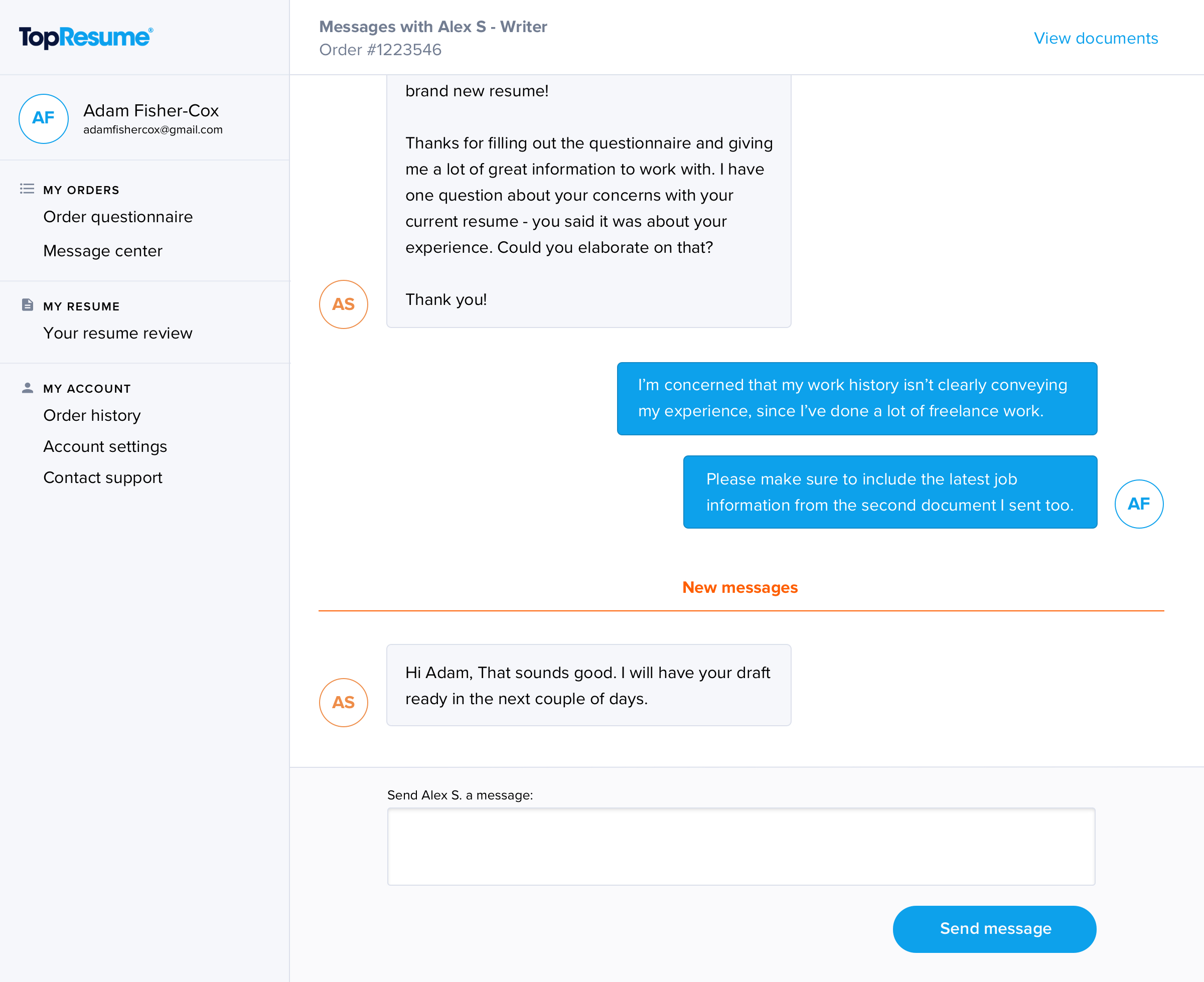
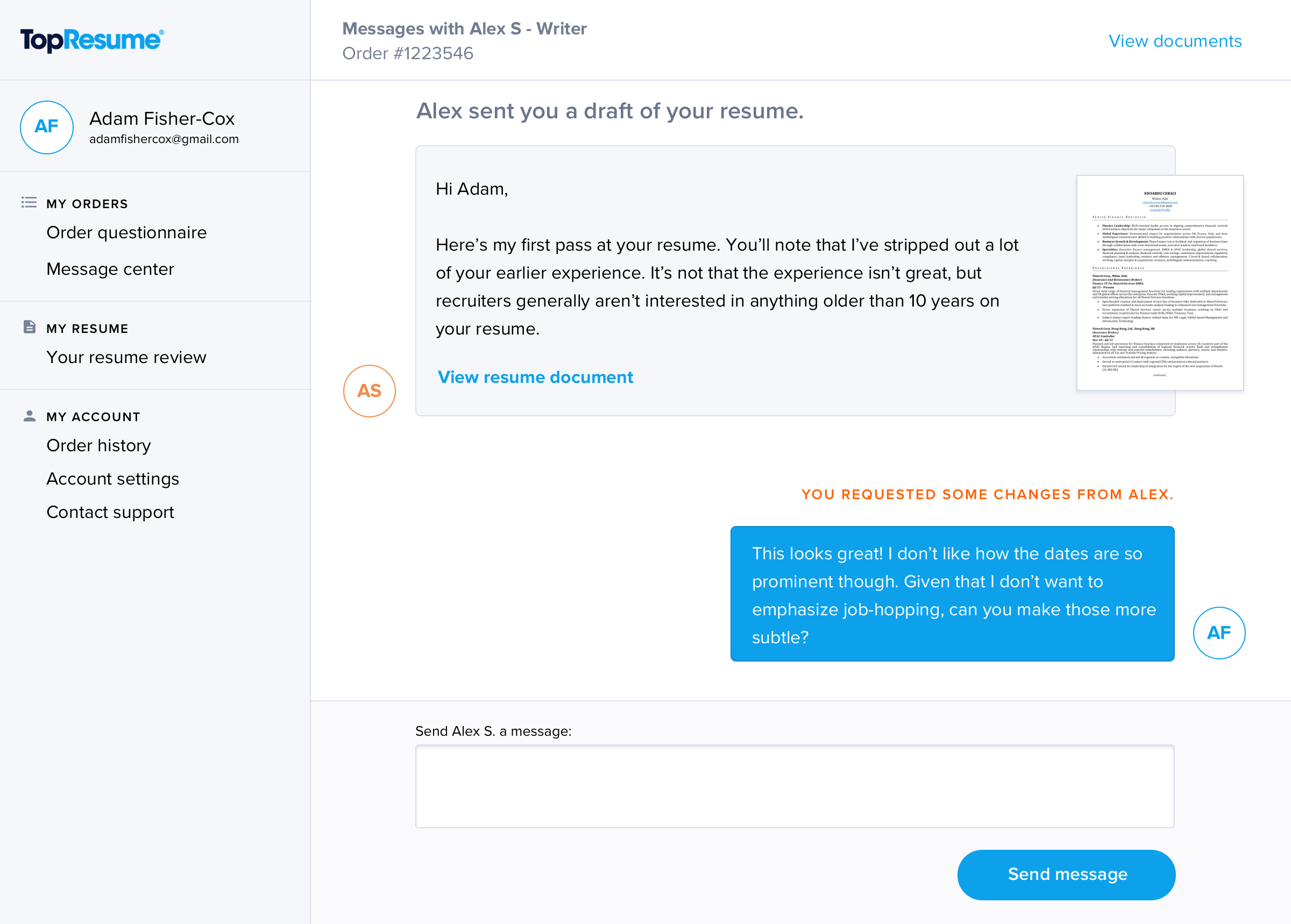
While the writer is getting to know the customer and writing the first draft, the chat interface is open for them to write back and forth, asking and answering clarifying questions and providing context for the writing process.
When the writer has finished a draft, however, the ability to send a message is hidden for the customer, requiring them to view the draft. We display the draft in our own interface, which limits the customer's ability to give feedback through other avenues.
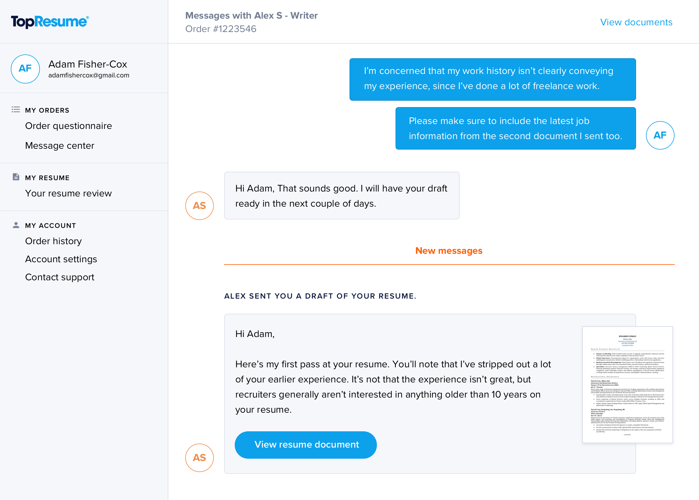
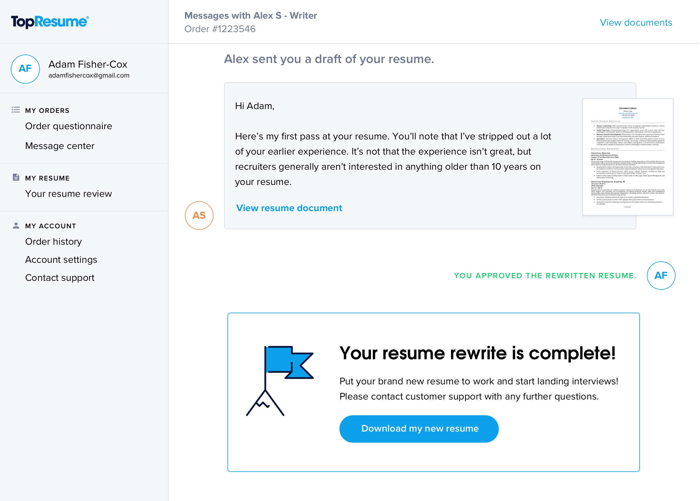
When the customer views the draft, they are shown not just the document itself, but also any message the writer has sent to give context or ask questions. The customer can then either approve the document or request revisions with one feedback message.
After submitting feedback, the customer is returned to the chat interface, where their feedback appears as a message. They have the option to send further messages in case they forgot anything, but the limitation to a single message in the previous step is designed to encourage them to collect all their thoughts before sending, hopefully making the writer's job easier.
When the customer approves their draft, messaging is again closed to avoid the option of continuing to ask for changes. Customers who have changed their mind are now forced to use the correct route, which is to contact support.
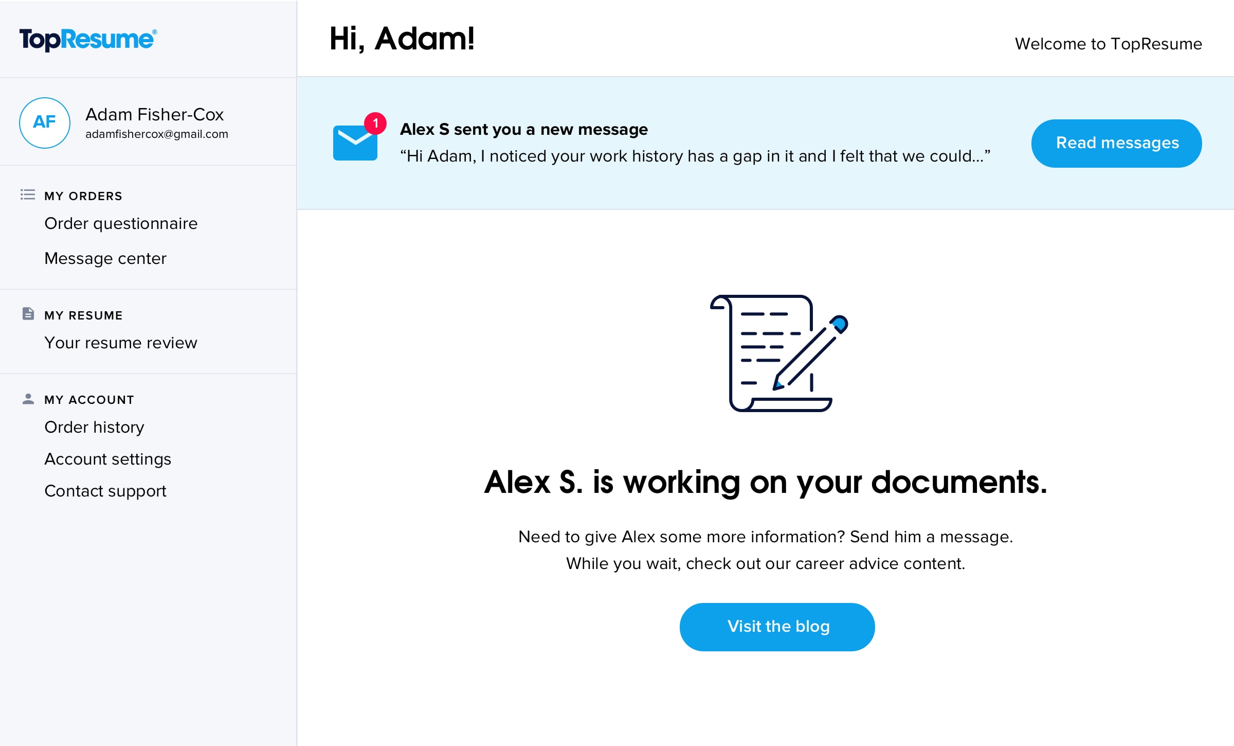
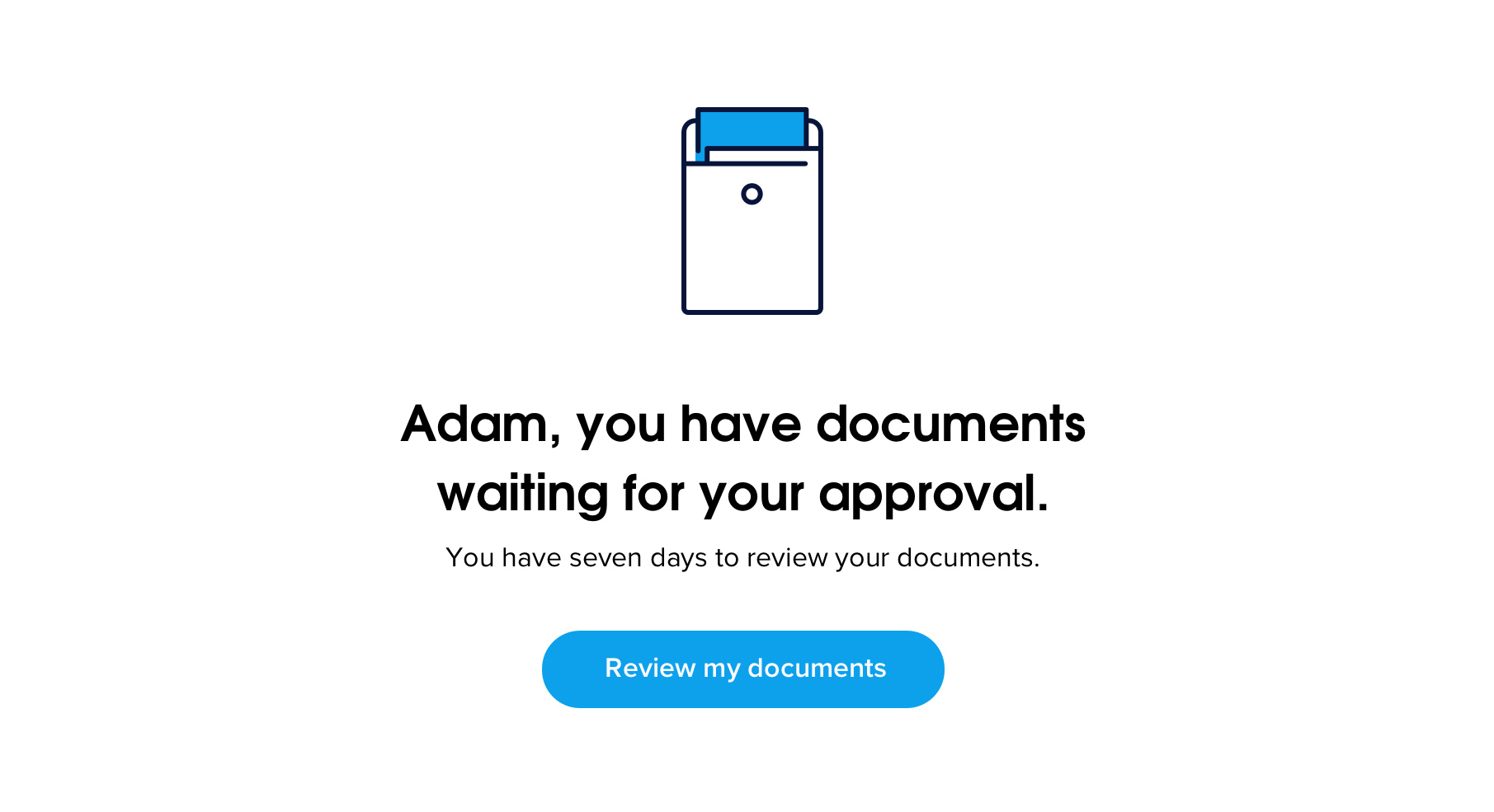
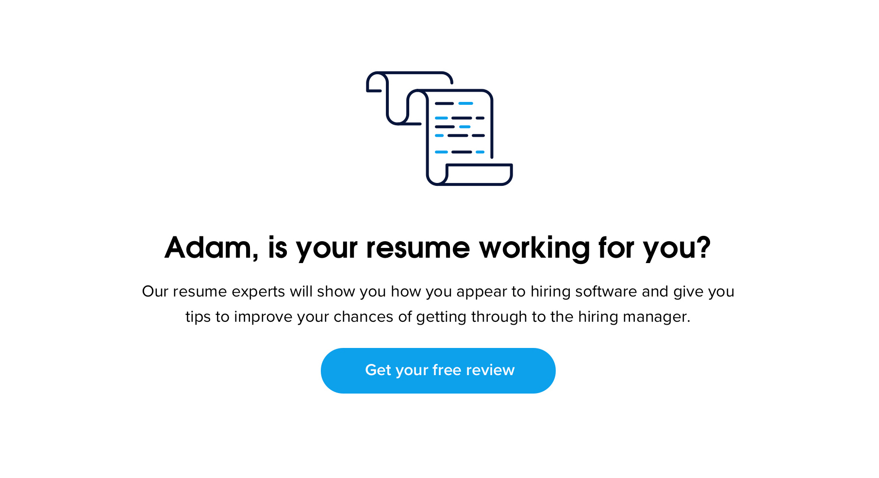
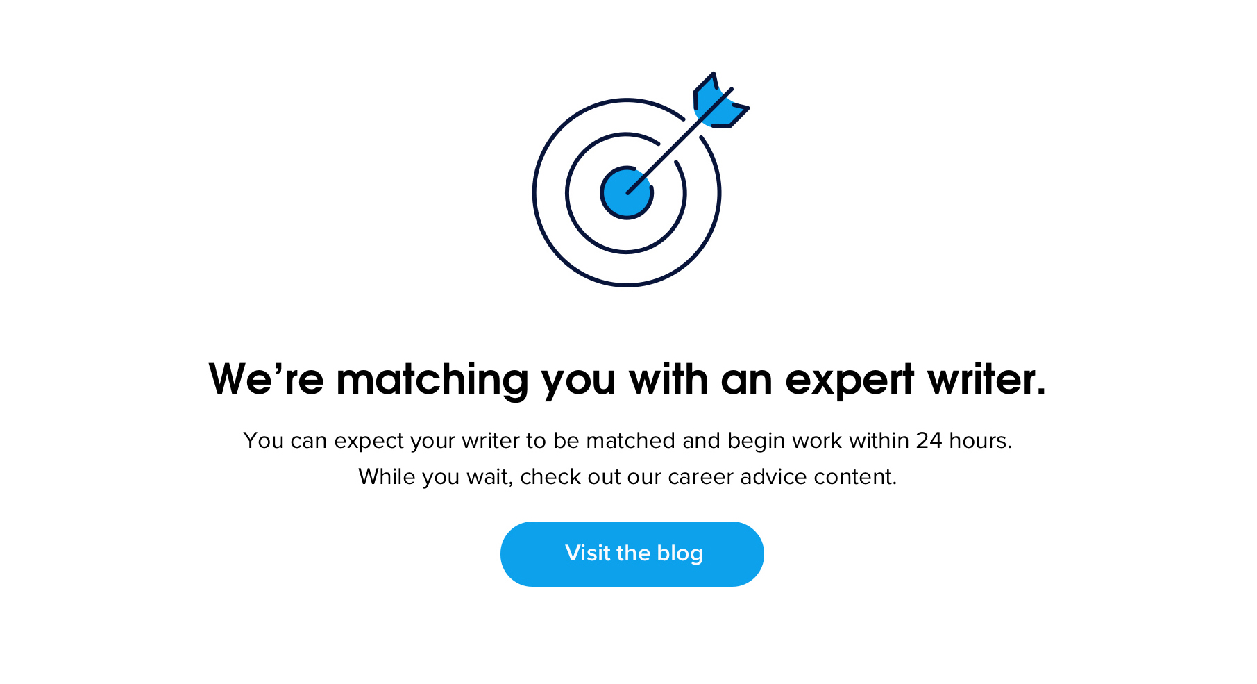
Keeping Customers Reassured
We designed an account dashboard with messaging for each stage of the customer life-cycle. The goal was to make life simple: every visit to this page would either ask for information from the customer to continue, or give the customer a status update on their order.
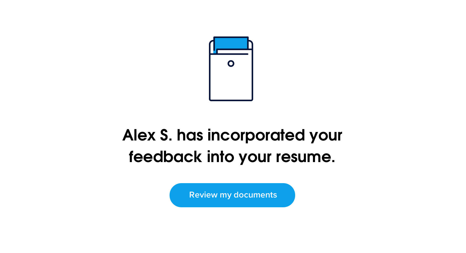
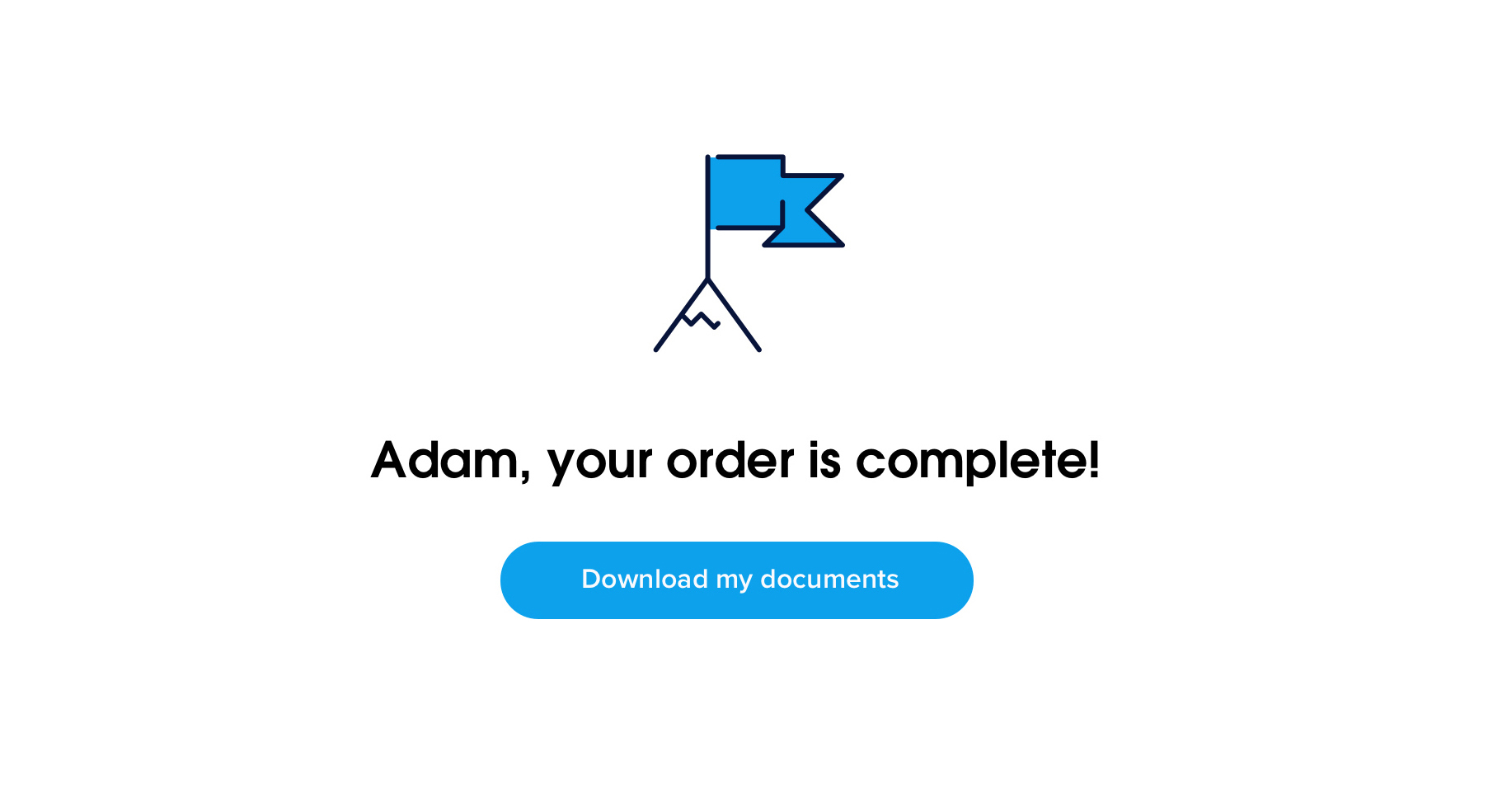
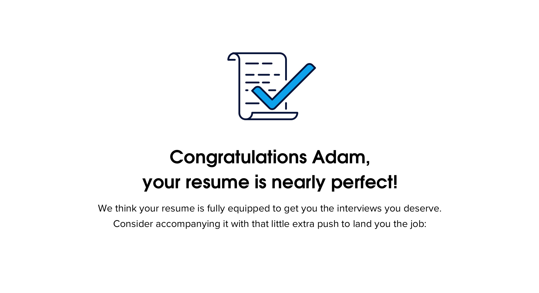
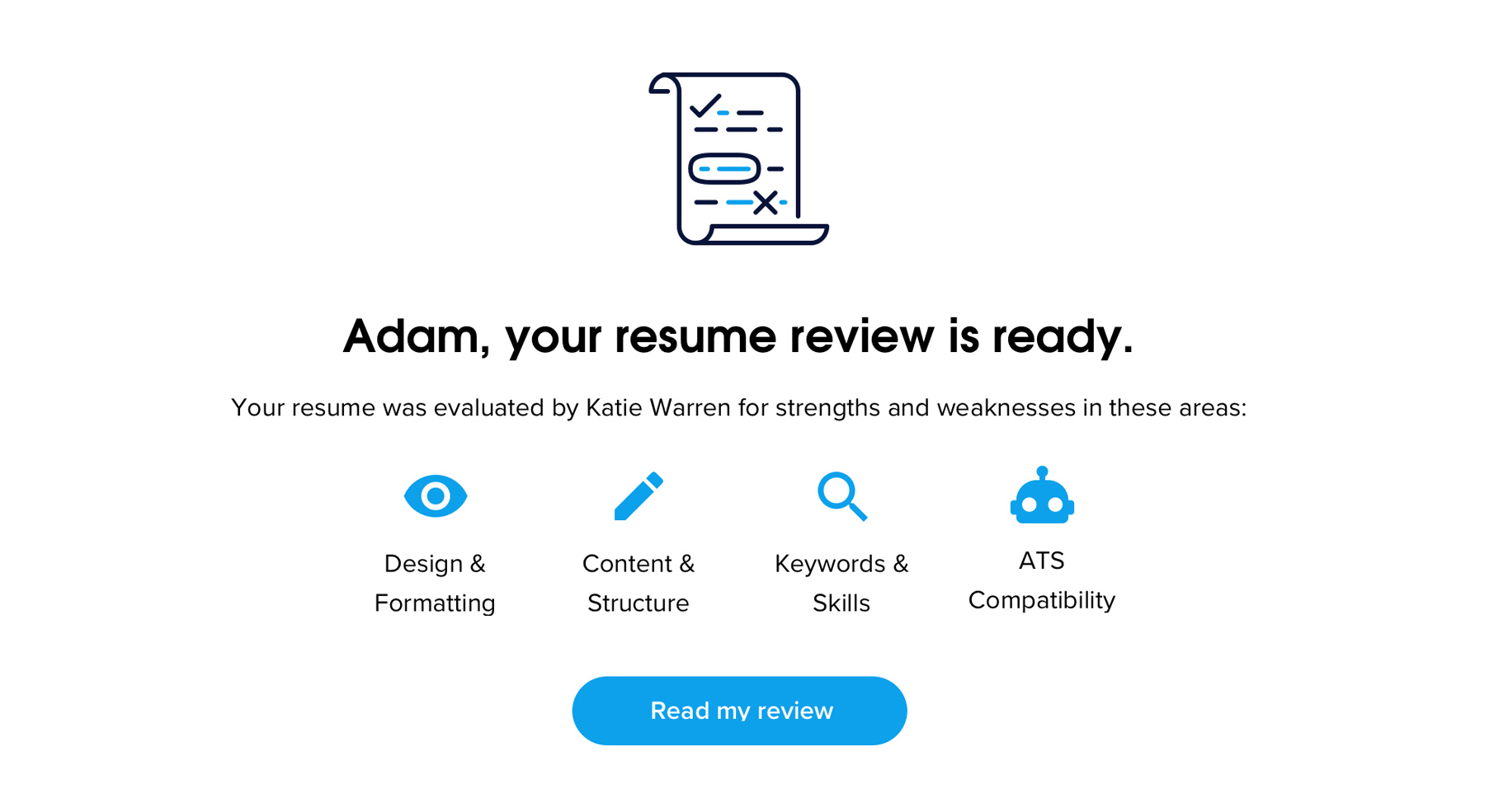
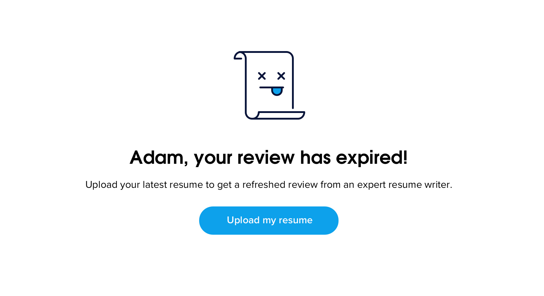
As a final layer, we created a new design language for our iconography that is modern but suited to the personal, document-centric resume-writing business. Our goal was to make the process feel friendly yet professional and add some levity to what can be a tedious information-gathering process.