
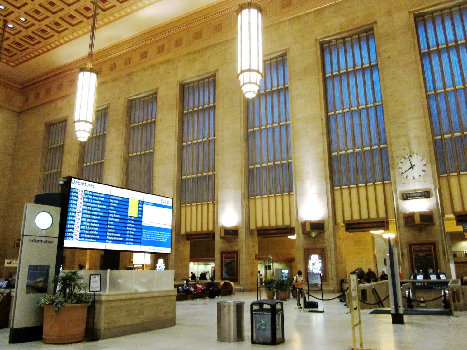
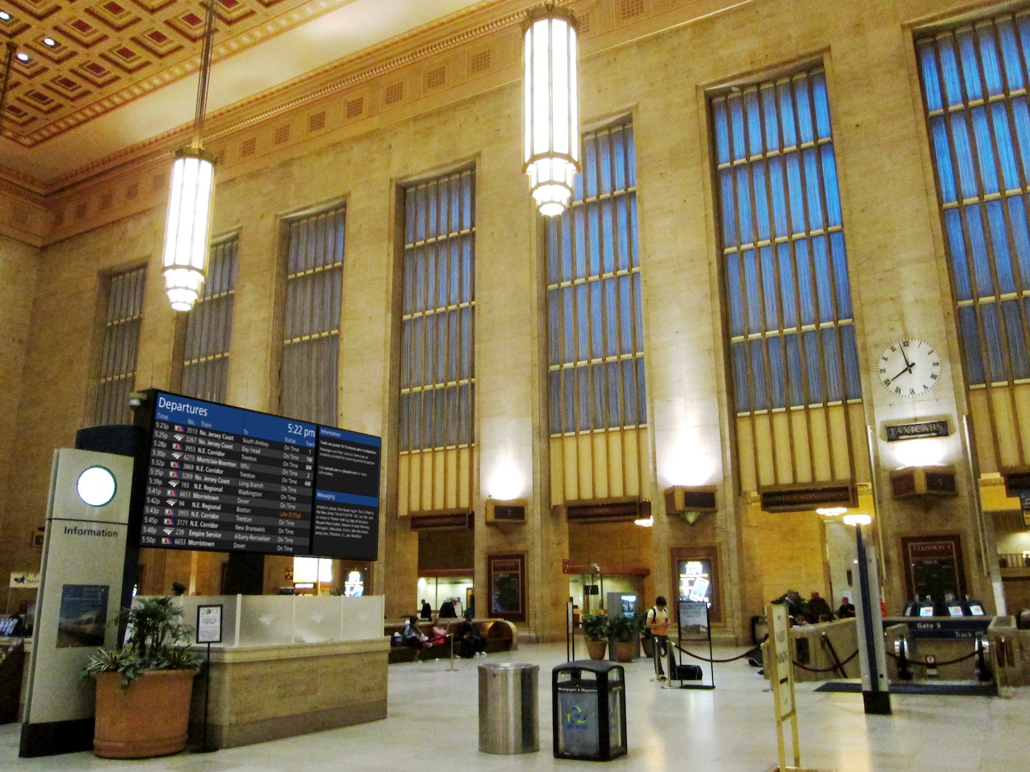
In late 2018, news of the removal of Philadelphia’s 30th Street Station’s old split-flap departures board caused some outcry for nostalgic and aesthetic reasons. The whirring and clicking of the board’s periodic updates was a comforting and familiar sound while you waited in or passed through the station, and the analog machine seemed to fit more nicely with the historic station than a giant screen might.
Amtrak, owners of 30th Street Station, needed to replace the board for many reasons, primarily because it failed to be accessible under the Americans with Disabilities Act (ADA). The letterforms were too small and light, they used all upper-case, which is difficult to scan, and the sign was not highly legible at any great distance.
A large digital display will replace the board, and nearly all the reaction on social media has been negative, anticipating something garish and out of place.
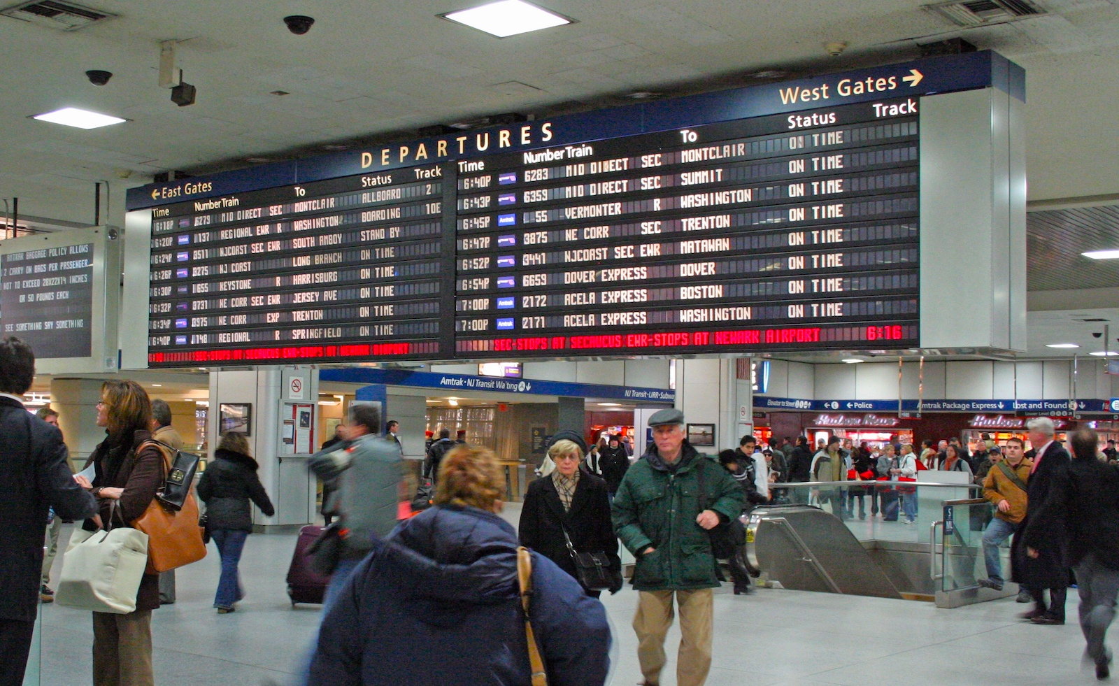
Amtrak removed their analog board at New York Penn Station in the past couple of years as well. As a part of the reviled Penn Station, it didn’t have the same nostalgic value for New Yorkers as 30th Street’s sign does for Philadelphians, but what they replaced it with probably gives a good indication of what’s to come for Philly:
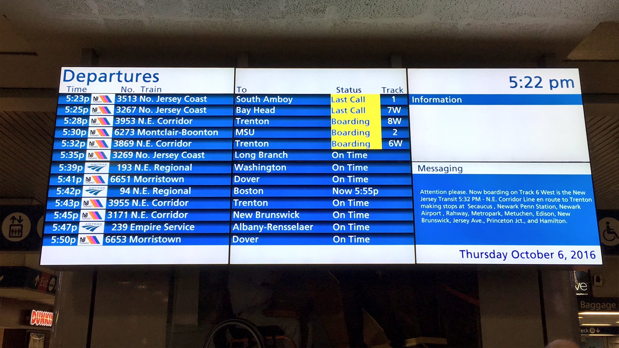
Does it have to look like this? One design theme that seems all too common in new ADA-compliant digital signage is bright colors, gloss effects, and otherwise garish design.
Perhaps this is a hypothesis that bright and saturated helps it be seen well, or is better for poorly-sighted people. Perhaps it’s a matter of simply checking the boxes of ADA compliance without thinking holistically about the signage. Perhaps it’s simply a stylistic choice on the part of the designer or the client. Whatever the reason, these additions do more to damage readability than enhance it, and are an aesthetic eyesore as well.
I won’t go full-nostalgic here and assert that older display boards are themselves any more inherently aesthetically pleasing or well-designed. The aesthetics of a hulking black box leave something to be desired, and I suspect only appeal to us as something we’re used to and something that feels “classic.” The design has many limitations as well – rows and rows of squarish uppercase letters are difficult to scan, for instance – but the limitations do force a more restrained approach that puts the information first. The flexibility of the digital screen makes it much easier to give into urges of adornment, extra decoration, and complex layout.
There’s no reason we can’t have both the flexibility and accessibility of digital systems with the restraint of the older boards. In fact, there’s no reason the digital screens can’t be an improvement in every way, and I think it’s an unfortunate example of how much good design is overlooked in transportation that aesthetics are not a minimum requirement for the replacement screens.
To start with, removing the bright blue and bright white backgrounds from every single row both makes the signage more aesthetically pleasing and less blinding, while increasing the contrast between foreground and background, a key metric for accessibility. Leaving the white rows sparingly to call attention to boarding trains uses the display’s inherent brightness to its advantage without blinding the viewer.
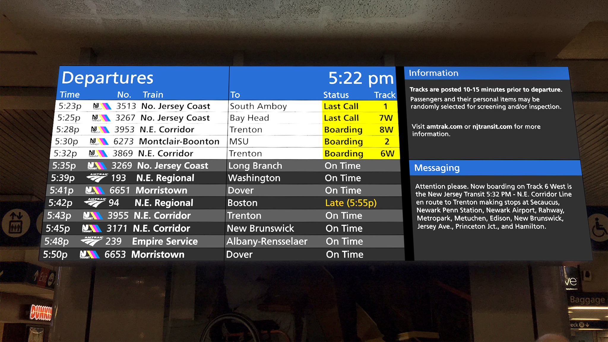
Introducing much more considered separation of rows, alternating in shade, helps separate information without adding visual clutter.
Trains that are boarding now are highlighted more noticeably than the split-flap board ever could, while the overall character of the board still matches the restraint of the black and white split-flap board. A relatively modest shift to the design like this can make the new displays as dignified and restrained as the split-flap boards, while adding all the improvements that digital screens can bring.
Nothing I’m doing here is ground-breaking or anything any attentive designer couldn’t do – it took less than an hour of changing some colors around and tweaking the layout. There are probably many more improvements that could be made. With so much low-hanging fruit, it’s all the more upsetting when something like the Penn Station signage makes it out into the world.
All it requires is for someone in a position of power on these types of projects to see the end result as a holistic customer experience, rather than a checklist of requirements. Many government agencies aren’t set up to promote this sort of holistic thinking, but it’s critically necessary to building trust and positive experiences with public transportation.
Hopefully the upset over the 30th Street Station sign causes some realization that there’s more to these public spaces than simply catching a train. There is real value in design aesthetics – not just as decoration, but as tools to improve customer experience in every space, from the beautiful and historic to the Penn Stations of the world.