After seeing the positive feedback on my redesign of the NYC Subway’s countdown clocks, I couldn’t stop thinking of the many other ways the MTA ignores good information design principles in communicating with its’ customers.
Redesigns might not have as large an impact as fixing the subway’s signals, but they’re relatively low-hanging fruit that could vastly improve communication, which is half the battle. I might not like it when my train is delayed, but if the reasoning and expected delay is communicated well, it puts me much more at ease.
So what is planned for today’s redesign exercise? the MTA’s website.
However, in a twist of fate, the MTA finally released their redesigned site the day I planned to release this write-up. So, instead of just talking through my process, let’s see how they stack up.
In this corner, me, one opinionated dude winging this as a side project with no user feedback or insight into the MTA’s playbook. In the other, the MTA, with a pretty bad track record on digital products, but a lot more resources. Let’s also mention that only one of us has actually designed, developed, and released a site, while the other has designed a few screens and will wave his hands around and say “you get the idea” about the rest. Let’s get to the hand-waving:
Note: This is just a shallow dive into what would be a huge project – I try to consider everything the website contains but will focus on primary use-cases and did not do any deep exploration of the content of the site. Furthermore, I rely heavily on my gut instinct and personal experiences with the site to inform my design decisions. User-testing and data collection would be key to informing this design in the real world.
The Homepage
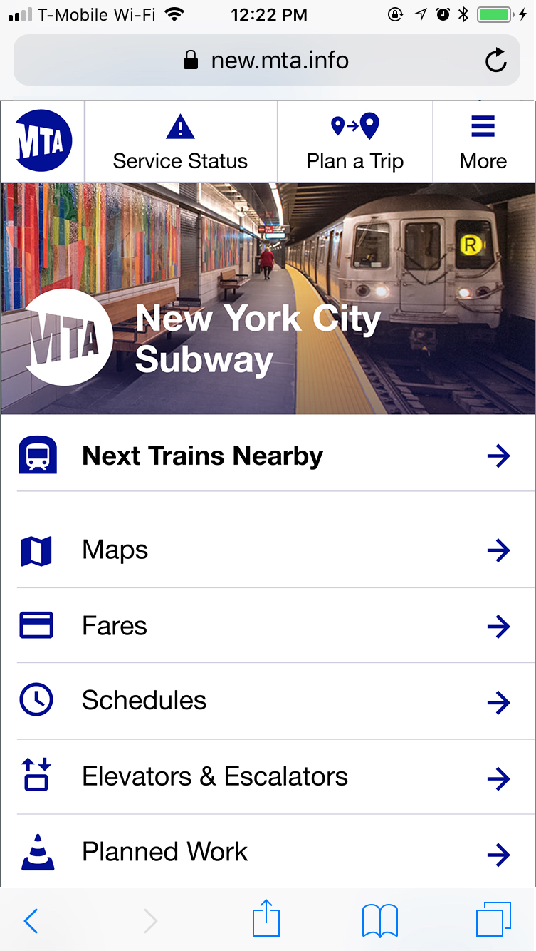
What are people coming to this website for in the first place? Information on their mode of transit. In the thumbnails, I’ve highlighted what percentage of this page is relevant to you depending on what mode of transit you’re riding (left to right: Subway, Rail, Buses). All that black space? irrelevant to most people.
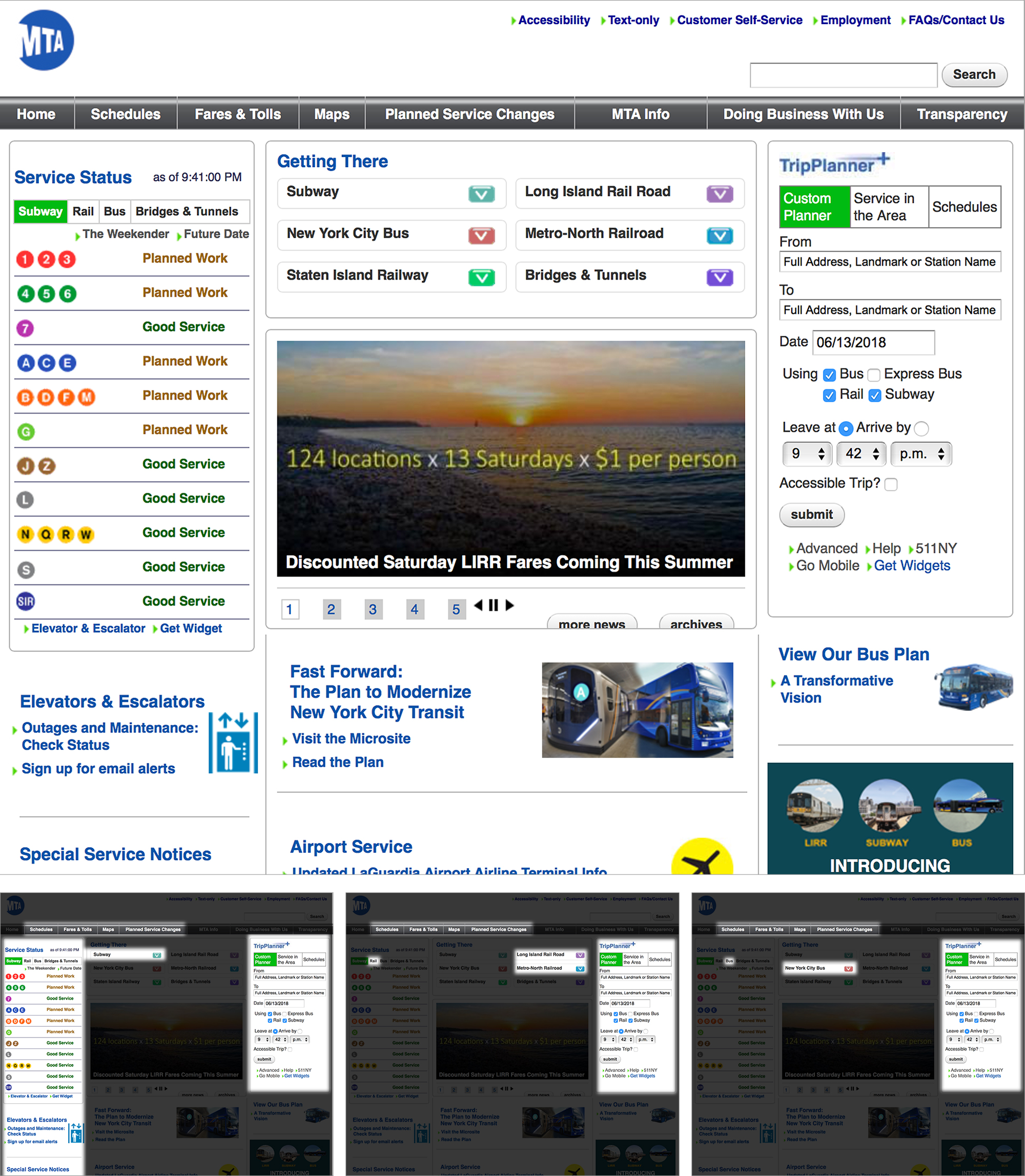
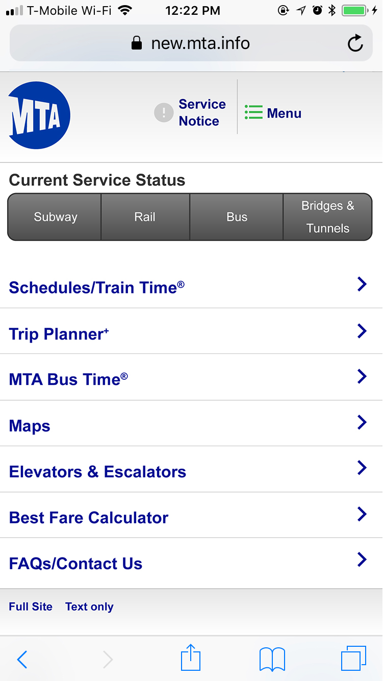
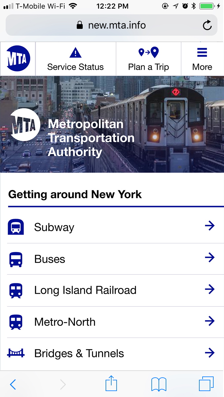
The MTA definitely realizes this disconnect, because the (old) mobile version of their site cuts a ton of this cruft out, focusing on trip-oriented information. Neither approach is great – a mobile website should have all the same information as the desktop site available – but the mobile version gets much closer to being functionally correct. Below, from left to right, are the current MTA homepage on mobile, my proposal, and the MTA’s new beta site.
In my version (center), trip planning and system status are persistent in the menu bar on all pages. Everything else lives in the menu, and primary functions are presented immediately on the page itself. Neither version from the MTA agrees with my biggest change: switching the information hierarchy of information (Maps, Fares, Schedules) and modes of transit (Subway, Train, Bus).
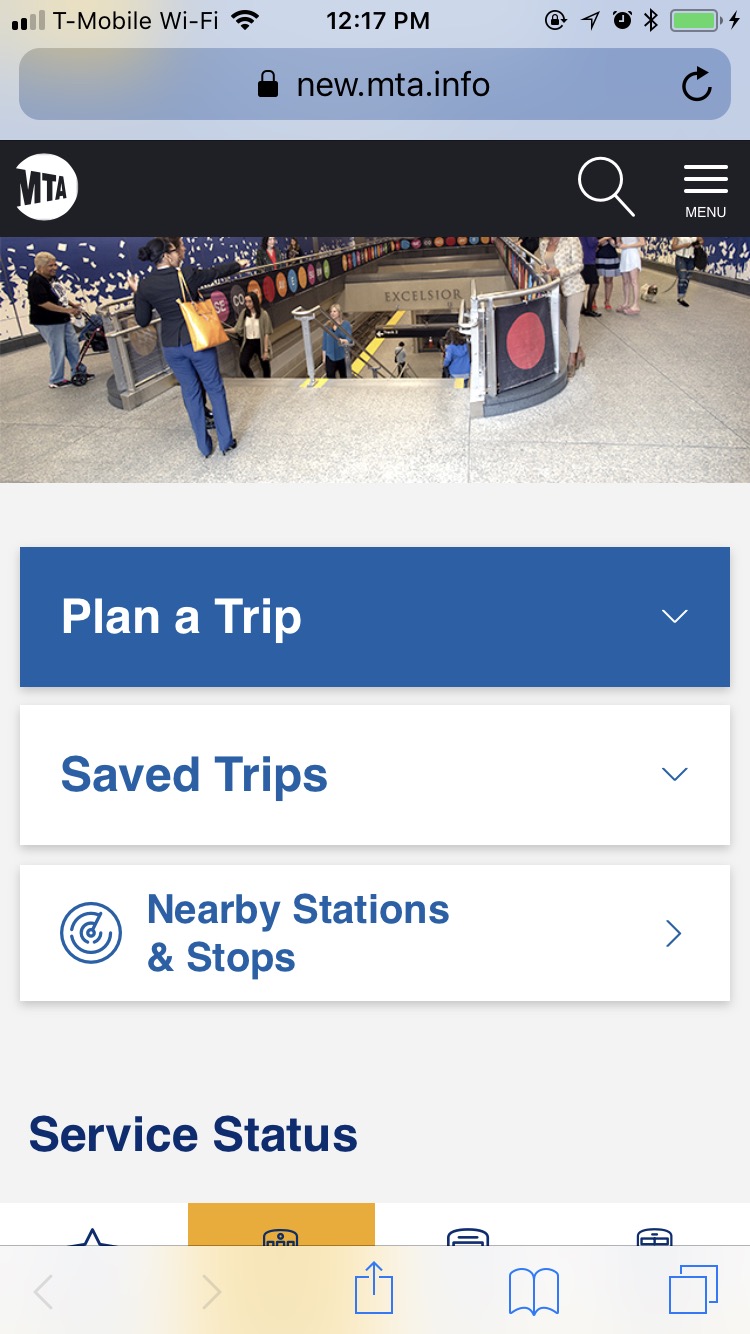
The MTA’s old site asks the customer to pick what information they would like: schedules, fares, maps, etc. Then on the next page, they choose between the Subway, train, or bus. This creates two levels that you have to back out of if you want to check both the fares and the maps for the Subway, for example. In most use-cases, you’ll be primarily interested in one mode of transit for multiple pieces of information, not the other way around. The new website has the same general structure but makes the problem worse by hiding those options behind the menu in the first place, ceding way too much space on the homepage to planning a trip.
System Status at a Glance
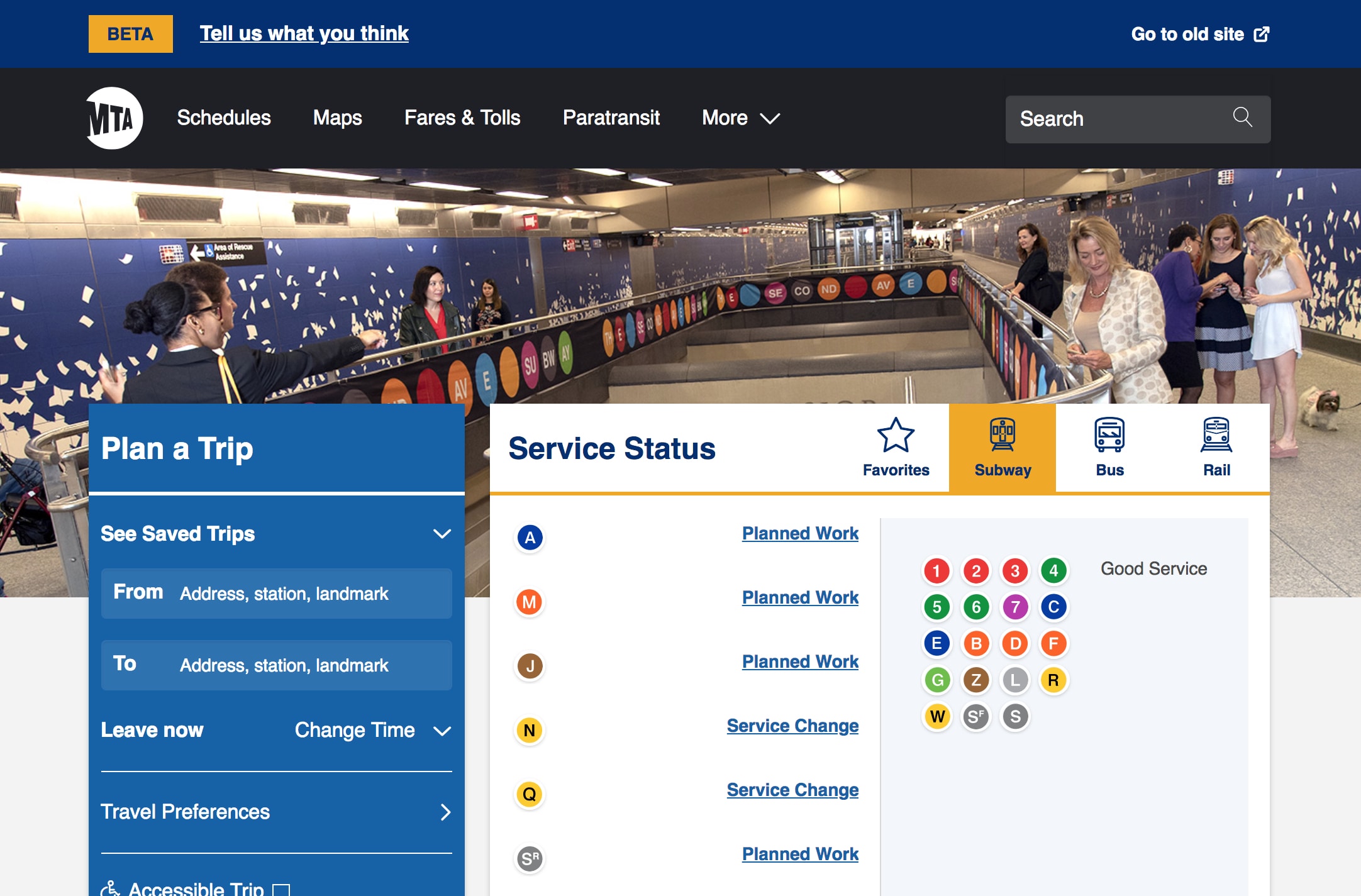
Here are how the persistent “Menu” and “Service Status” tabs look when opened. (We’ll get to the trip planner later.) I believe that especially on mobile, making cognitive load smaller is preferable to minimizing the amount of clicks to get the desired answers. For this reason, I’ve really focused on keeping content minimal and limited to common tasks and topics that you can drill down into. On the left is the new MTA site’s System Status design.
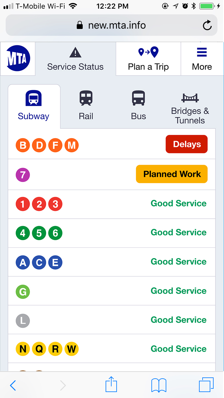
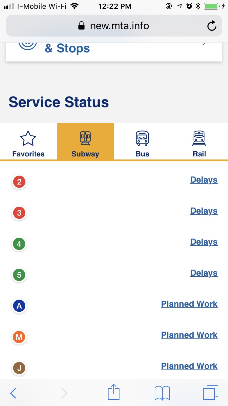
The MTA’s design is nice in that it separates out delays on each train, while mine will show a delay for NQRW even if it’s just the R. However, the amount of wasted space demands a better solution, and I question in how many scenarios delays only affect one train on a trunk line – though for planned work this is certainly useful.
Service-Specific Pages
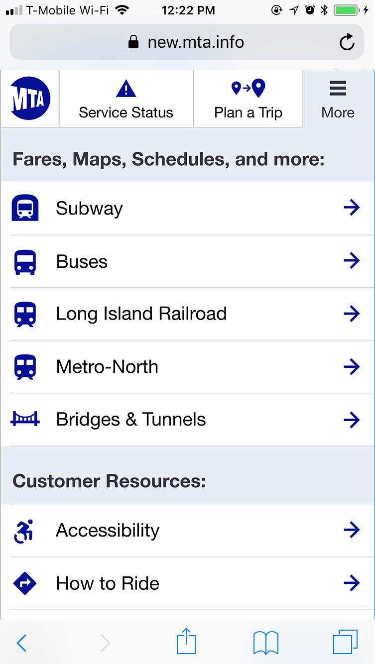
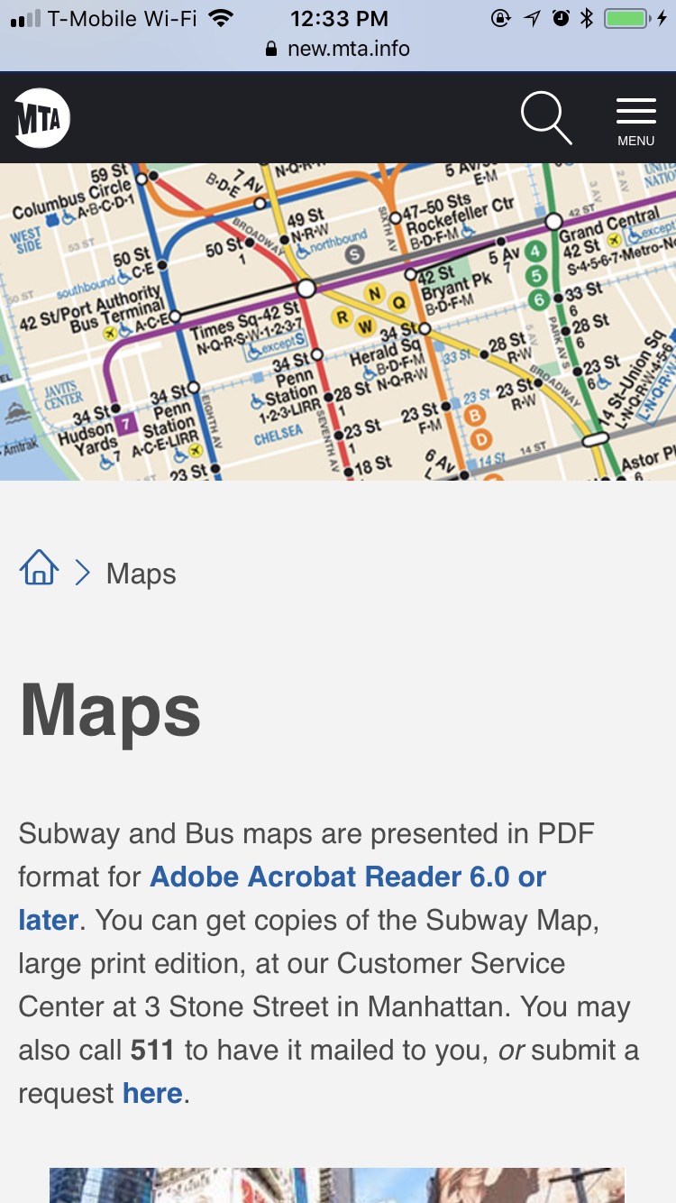
A key feature of my proposed design are the service-specific pages, one level down from the homepage. Click on “Subway” and you’ll be taken to the Subway homepage with all the information related to the subway system in one place. The old MTA site used to have something like this, but the new one doesn’t have anything I can find. Because the MTA has prioritizes the information type higher than the transit mode, their top-level pages are things like Maps, Schedules and Fares:
As I mentioned earlier, I believe this makes for much more backtracking when you’re trying to get multiple pieces of information about the same mode of transit. Making each transit mode’s homepage just one click away from the homepage also means that it’s only two clicks away from anywhere in the site.
Real-Time Arrivals
Probably the number-one feature of the site is the answer to the question: when is the nearest train coming? The MTA has much improved their information design in this regard, though the usability is pretty terrible on mobile. My proposal is below right, while the MTA’s design is the left two screens.
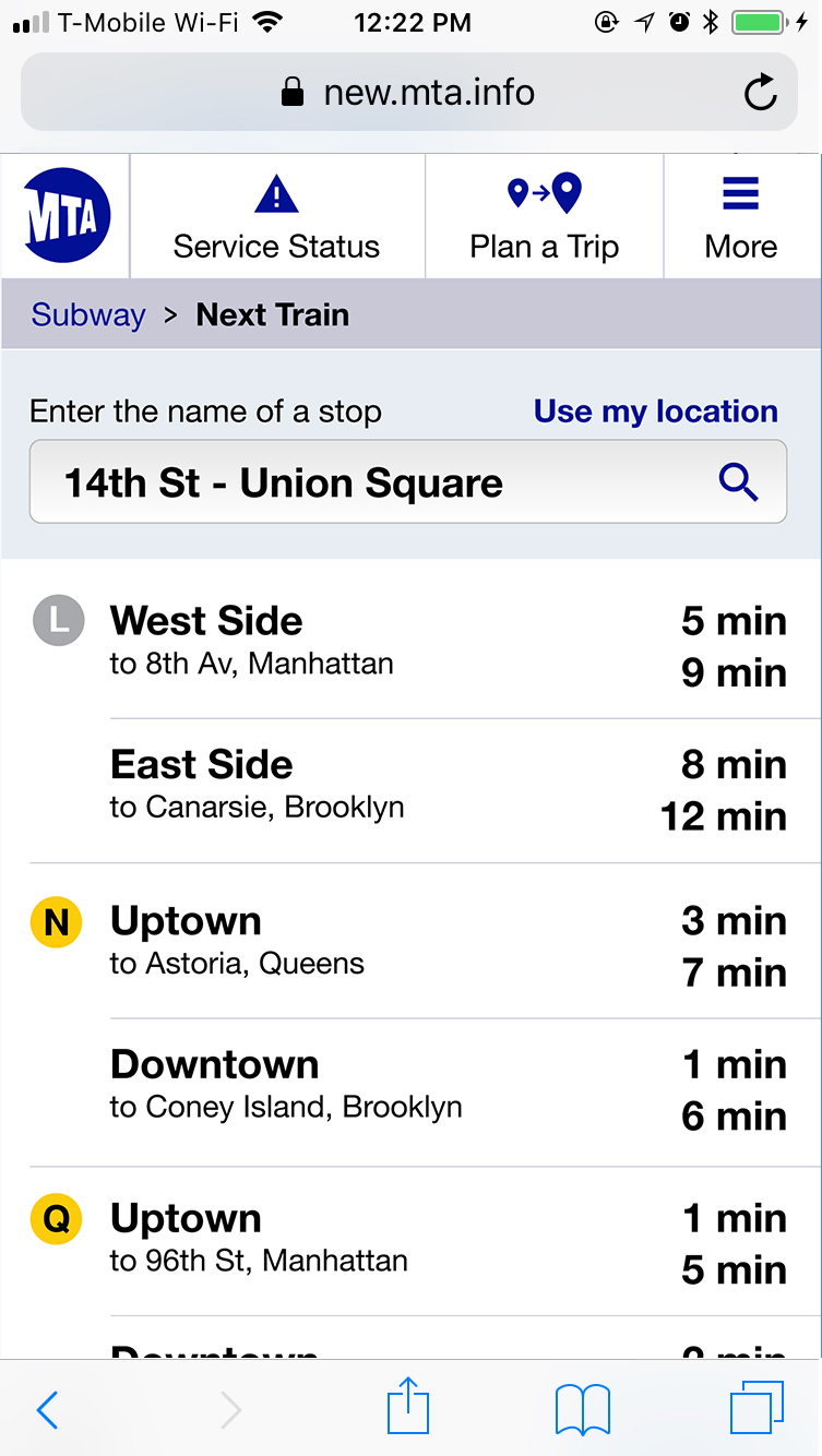
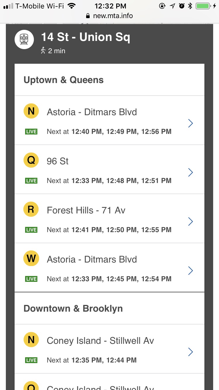
I think the MTA’s display of which trains are next is better than mine – sorting primarily by the direction the train is going, and showing all the trains headed that way. Most people will be interested in more than one train, especially in Manhattan (for instance, I can take the N or the W back to my apartment in Astoria, and I might even want to grab the Q on the weekends to try to catch up to the local N or W that may have just left.)
My design sorts by the train letter, showing next arrivals in both directions. This may display more information in a logical way, but it doesn’t quite answer the question as well which is “what trains are coming next in my direction?”
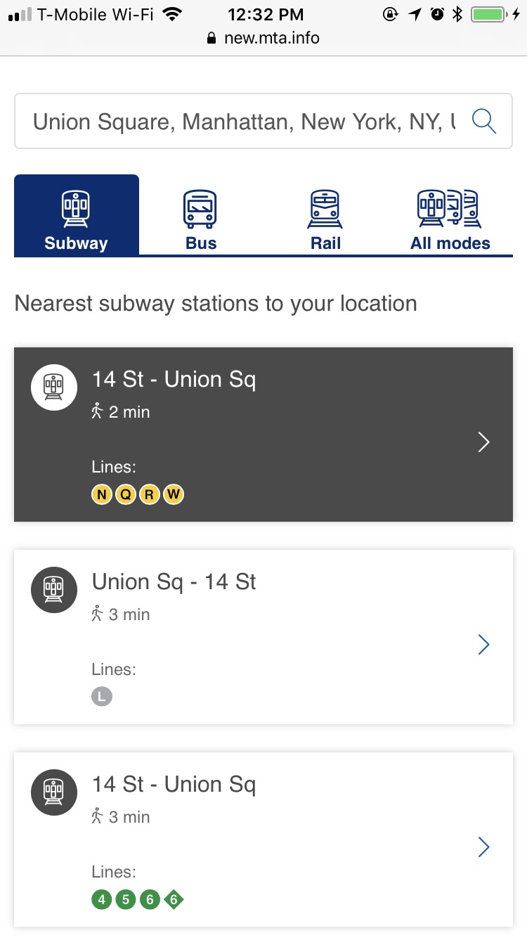
The MTA also does a nice job combining this feature with a “nearby stations” finder which is useful for people less familiar with the system who don’t know their desired station already.
All that said, it’s incredibly unclear how to use this. On mobile, you enter your location and get a list of nearby stations. Tapping one opens the list of next trains to arrive, but does it way lower on the page and doesn’t scroll you down to that location. The net effect is the appearance that nothing has happened. A huge problem, but a simple fix.
The Desktop View
So how does this all expand to larger screens? Much as you’d expect, with some tweaks to account for the likely different context of viewing on a large screen: you’re probably at home or in an office, or coffee shop – the information you’re seeking is likely more future-oriented than “I’m in the station now, where is the train?”
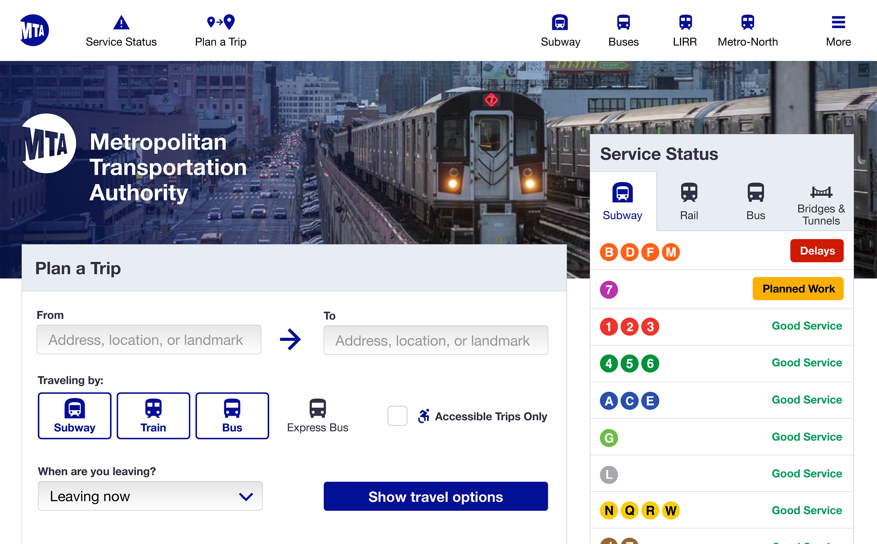
As such, the homepage focus is on trip-planning and system status. The expanded navigation bar provides room for more dropdown menus, again sorted by mode of transportation. Clicking “Subway”, for example, will drop down a menu with all the options we’ve given on mobile: Maps, Schedules, Fares, etc.
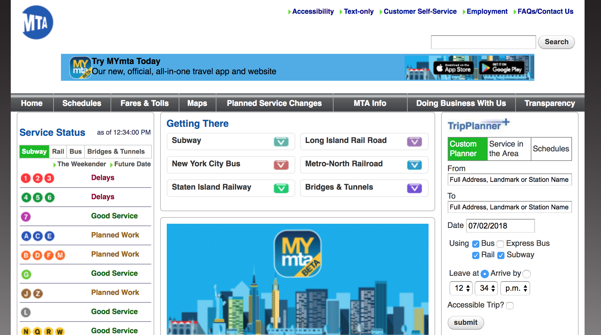
The MTA has come to the same conclusion, with a bit more blue and gold:
In Conclusion
I’m happy the MTA now has a website that doesn’t look like it was built on Geocities in the mid-90s. I think it’s difficult for it not to be an improvement, and I’m encouraged by the amount of irrelevant information they have totally removed from the site. I worry that not enough thought has been given to the hierarchy of information on the site, but it’s quite possible (even probable) that my instincts do not match how the site actually gets used.