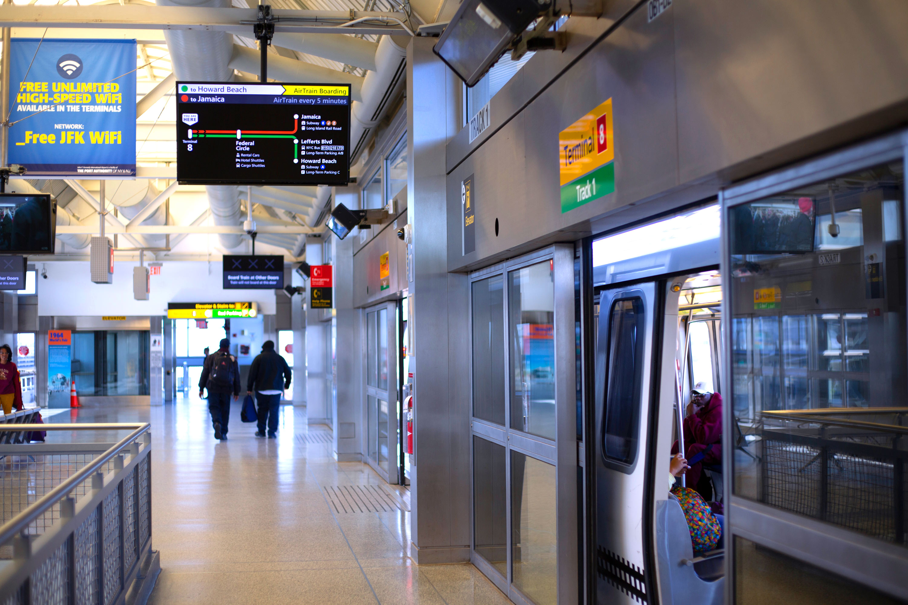
I worked with the Port Authority of NY & NJ to design new wayfinding and train arrival displays for the AirTrain at JFK Airport. (A link to the complete project case study is at the end of this article.)
Here, I’ve broken down a what I found to be a difficult piece of the puzzle – figuring out how to best represent the AirTrain system in a small on-screen space.
While working on the project, I challenged myself to meet this goal: Answer the question “Can I get to my destination on this train?” in under 5 seconds.
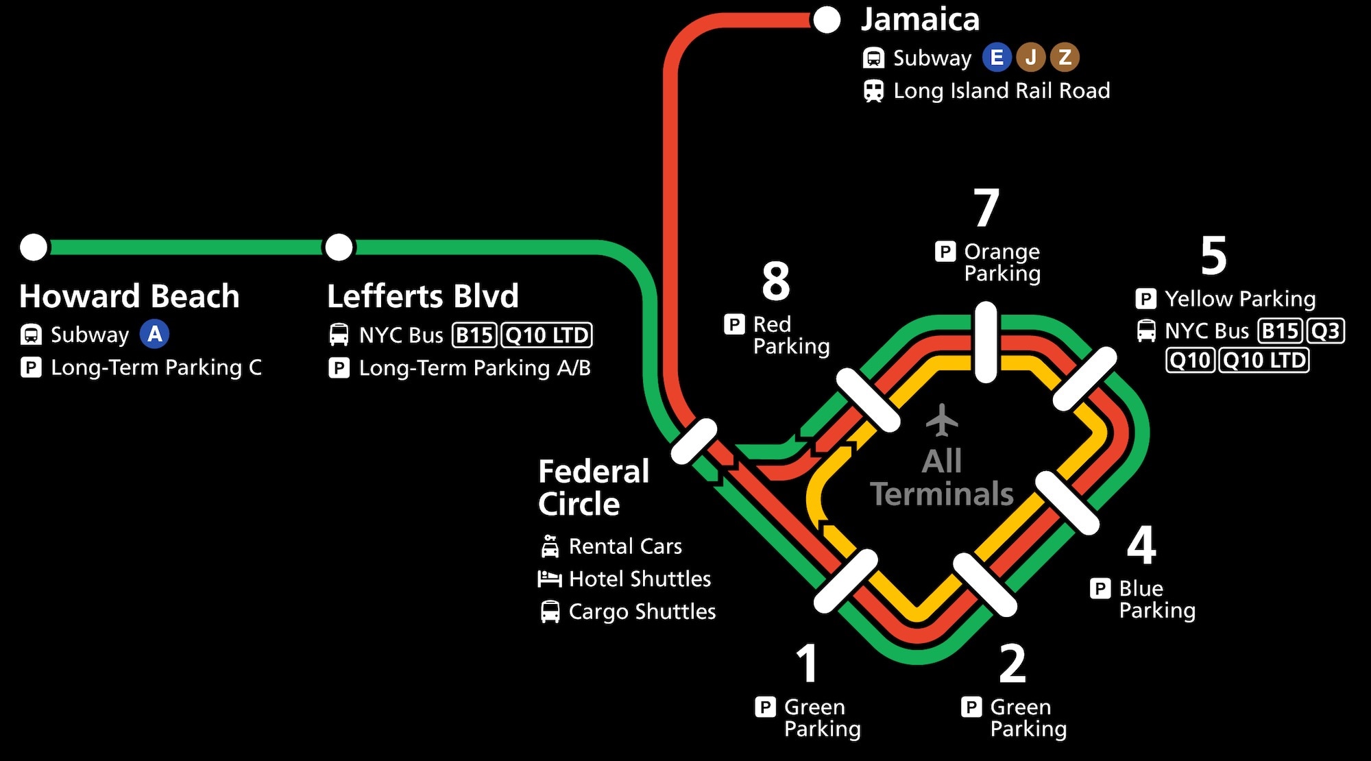
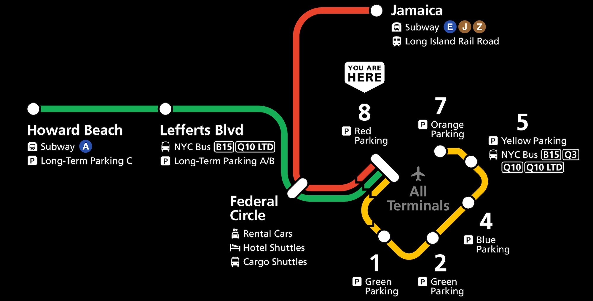
A natural starting point was thinking about the map of the full system, which fails to meet that goal:
There’s a time and place for both a geographic map and a simplified diagram of service, and I felt that these on-platform displays were definitely a case for a diagram.
Geographic accuracy and a faithful depiction of the terminals loop make a full map a good tool for understanding the system and planning a trip in advance, but difficult to scan and comprehend in just a few seconds. In contrast, the on-screen diagrams serve an audience who may be rushing into the station right as the train pulls up and need to know immediately whether to get on or not.
However, transforming a map to a diagram inherently requires removing information and detail – even fudging the truth about how the system works in the service of greater clarity.
How could I know which things would be helpful to remove, and which things would hurt comprehension? To work for this audience, a few “rules” quickly became apparent:
Rule #1: Show only the most simple and direct travel paths
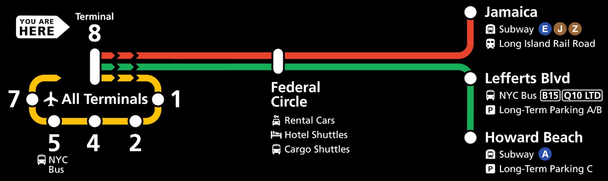
Let’s take the example of a traveler waiting at Jamaica Station, and remove everything except for the most simple, direct path to each destination:
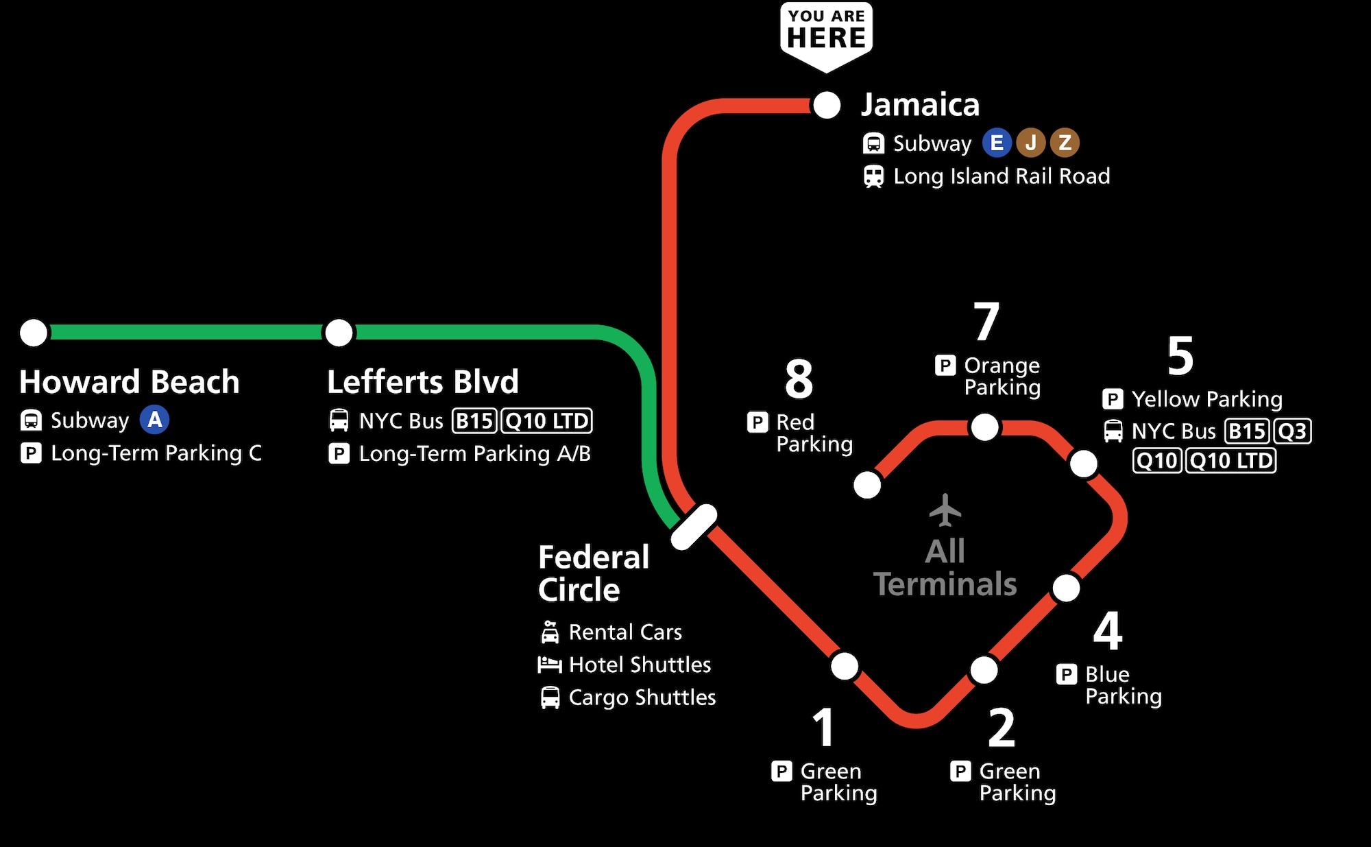
Removing other lines that don’t stop here will hopefully get you on the train that’s leaving right now instead of waiting for the next one due to uncertainty.
Transforming it from a map of a loop with no clear end to a linear map with a obvious start and end point clarifies that yes, it is headed toward the airport.
Sure, this doesn’t give the viewer 100% of the information they could use to make the fastest trip possible. For example, the yellow loop line is gone, so you would never know that you could shorten a trip to Terminal 8 by transferring at Terminal 1 to the yellow loop train in the opposite direction. But that’s not the point of this map – you’ll look up the full map in advance to plan for shortcuts like that.
Despite the improvement so far, it’s still pretty tricky to find your current location on the map, which brings up the next “rule”:
Rule #2: Ignore geography in favor of directional clarity
Geographic accuracy is helpful for figuring out how the AirTrain system relates to the larger New York City area, but in this case, travelers are just trying to see where a train goes. By the time they are at the platform, they already know what station they are looking to get to.
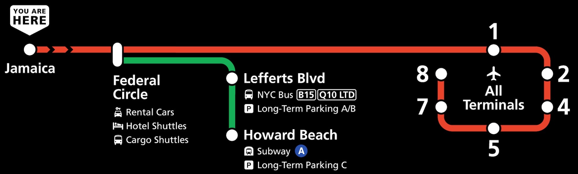
Organizing the map into a clear, left-to-right fashion makes it much easier to see where you are now, and which stops come next all the way down the line. The loop is improved here as well, clarifying that it will continue back onto the line without sacrificing the clarity of the line having an end.
The final and most “design-theory” heavy of the rules ensures that the most important information for the most people is visible the most quickly:
Rule #3: Answer the most common question most prominently
The right-to-left diagram also surfaces information in order of importance. The airport terminals are the first place the eye goes, due to being at the end of the line, the loop’s circular shape, and the “All Terminals” label, answering the number one question of “will this get me to the airport?” in seconds.
For those who have more time on the platform, there is more information about which order the terminals are in, and the connection to the Howard Beach line at Federal Circle for anyone who has ended up at Jamaica by mistake.
Playing by the rules
I used these “rules” to guide me in figuring out legible solutions for some trickier situations. Here’s a common enough situation where all trains share the same track in the loop due to maintenance.
Taking the example of a passenger waiting for a train on the in-service track at Terminal 8, there are three options, each in a different direction, but that’s not at all evident from the full system map:

Removing everything pertaining to stops before Terminal 8 helps a lot, as does disconnecting the loop, but it’s still a bit messy and difficult to find the “You Are Here” label at a glance:
Following the same “rules” as before, we can straighten everything out, and even keep the loop pretty much intact, preserving its relationship with the current station without confusing the issue of which direction trains will be going:
Take the train to the plane
The redesigned arrival screens are in use on the JFK AirTrain as of the last update to this post in mid-2024. If you fly through JFK, check them out and let me know if they help you on your journey!
The maps were just one component of this project. If you found this interesting, check out the full case study, which has more information on how the maps fit in context with arrival information, directional signage, and the platform environment.