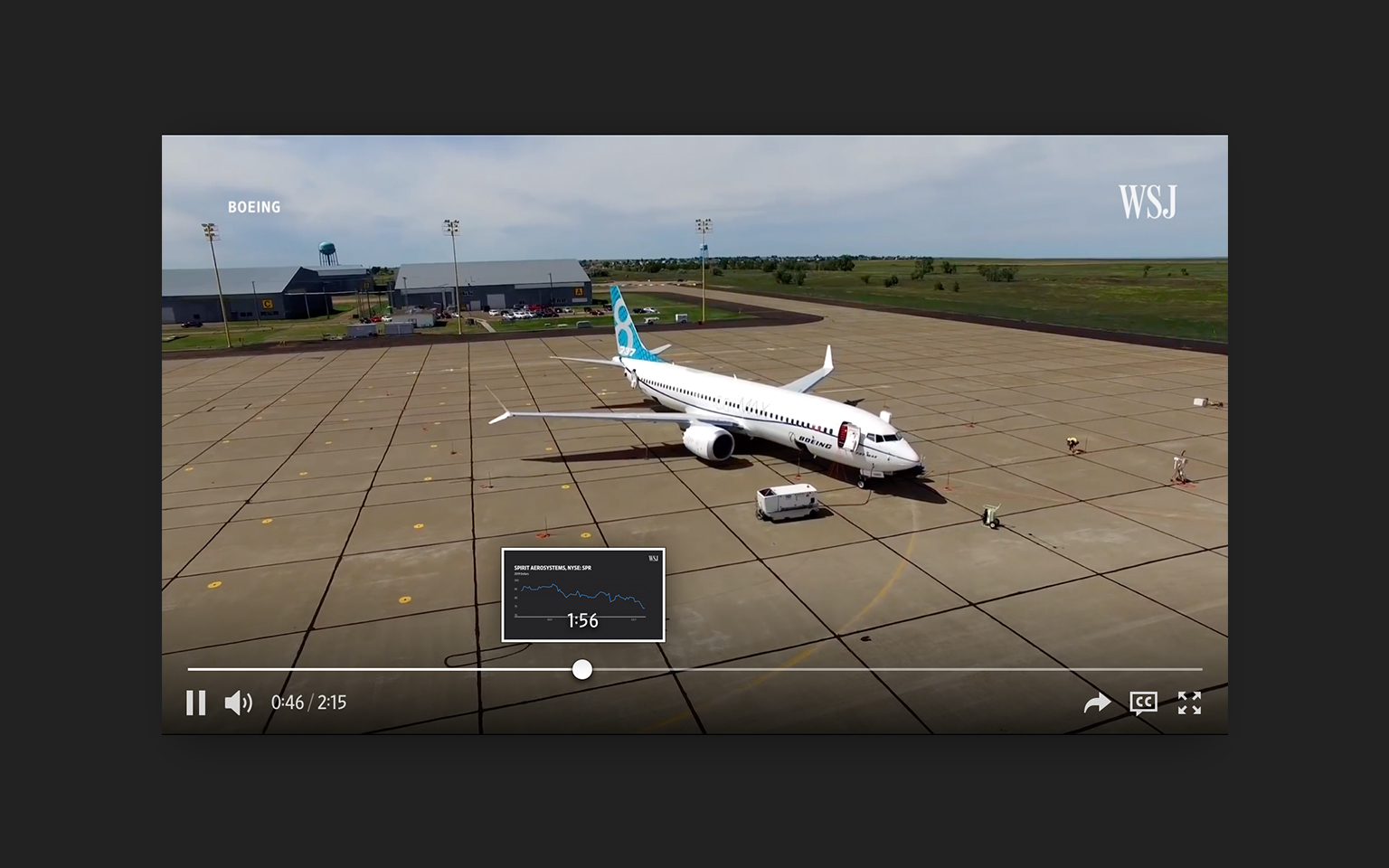
The Wall Street Journal’s video player is core to the experience on WSJ.com, appearing on the homepage, in articles, the dedicated Video Center, and also across all Dow Jones properties. The player was due for a redesign, as it was noticeably outdated, off-brand, and frustrating to use, especially on touch devices.

Our readers use video players daily across hundreds of different websites and apps, so they have an expectation and muscle memory of how one should work. Thus, the redesign first and foremost needed to conform to those expectations so that using it was a seamless and pleasant experience.
Achieving this goal of while making the player feel like a WSJ product required thinking in two stages: first considering every interaction to make sure the player “just works” as expected, then applying WSJ’s typefaces, colors, and visual styles to each element so the player looks at home on any WSJ page.
Making It “Just Work”
To make sure the player behaved as people would expect, we analyzed players from all over the web and across operating systems. Noting where they shared behaviors and where they differed, we were able to hone in on the most common and familiar patterns.
This research informed many small decisions that are hopefully unnoticeable, such as how the controls should fade away, whether tapping on the video should show the controls, pause the video, or both, and the differences in dragging the playhead to fast forward or rewind (also called “scrubbing”) with a mouse versus with a touch input.
We thought carefully about the content our video player would show as well: quick videos, in most cases under five minutes long. This influenced our decision to give the timeline control a full row to itself. Given our shorter content, each pixel along the timeline could represent relatively few frames of video, giving granular control without the need for additional buttons for stepping back-and-forth through a video.
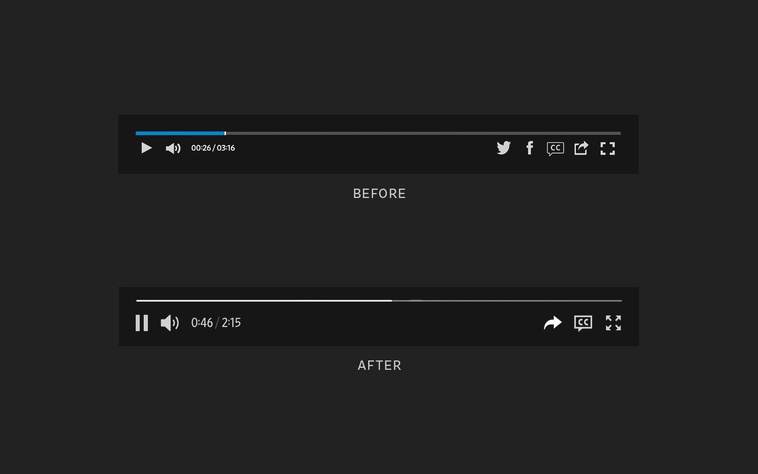
Visual Updates
Redrawing the icons with a shared stroke weight and visual sizing brought a more solid feel to the interface. Multiple redundant share icons were combined into one, with increased icon size and spacing, making the controls feel right for either touch or mouse input. Social sharing tools and other elements that previously covered the full video were redesigned to take only the space they needed, allowing users to continue watching the video as they interact with the controls.
The video player should blend into the overall WSJ experience for anyone using it – it’s such a fundamental part of the web browsing experience that grabbing a user’s attention would likely indicate a design issue. The process to get to the final product, however, shows the amount of thought that needs to go into every interaction, especially the simplest ones that come pre-loaded with user expectations.
We received great feedback, most importantly from those most familiar with the old player, thrilled to finally be able to interact with video as they expect, especially on their phones and touch devices.
The video player was designed and developed by: Adam Fisher-Cox, Marta Jakubanis, Thomas Williams, David Tinnes, Joshua Causey, and Joe Simon.